| Author | Thread |
|
|
01/10/2006 07:24:01 PM |
| I was the one who gave you the 10. I really liked this picture. It was very different from all of the other entries. It was very refreshing to come across this image during the challenge. |
|
 Photographer found comment helpful. Photographer found comment helpful. |
Comments Made During the Challenge  |
|
|
01/10/2006 06:22:52 PM |
|
| Photographer found comment helpful. |
|
|
01/10/2006 11:49:01 AM |
| i really like this composition. |
|
| Photographer found comment helpful. |
|
|
01/10/2006 10:10:28 AM |
| Right up there she blows. |
|
|
|
01/09/2006 10:21:37 PM |
| I like the use of composition in this photo and the simplicity of it. |
|
| Photographer found comment helpful. |
|
|
01/08/2006 05:29:00 PM |
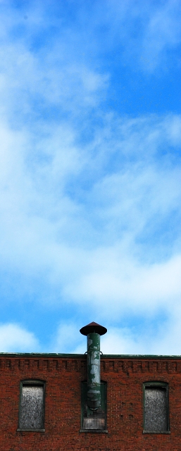
| Hmm i'm not really sure if this meets the challenge description or not. Either way, you should try tilting the image CCW slightly to straighten up the horizon. |
|
| Photographer found comment helpful. |
|
|
01/07/2006 08:00:22 PM |
| Nice artistic interpretation of this shot. I like the rich blue and red/brown in the shot. Well done. There appears to be a spot in the top-left corner of the sky (about 20-50 pixels in) - perhaps dust on your lens / sensor? |
|
| Photographer found comment helpful. |
|
|
01/07/2006 04:03:27 AM |
| there's too much sky in this photo |
|
| Photographer found comment helpful. |
|
|
01/06/2006 05:32:54 PM |
| I've seen this technique many times before, only, it's usually with the tops of people's heads, rather than the tops of buildings. This shot doesn't work very well, especially in regard to the ("city-life") theme. |
|
| Photographer found comment helpful. |
|
|
01/06/2006 02:35:34 PM |
| I think it is a bit too much sky. |
|
| Photographer found comment helpful. |
|
|
01/06/2006 06:53:16 AM |
| Narrow perspective seems confining here and sky not interesting enough to justify so much real estate in the picture |
|
| Photographer found comment helpful. |
|
|
01/06/2006 05:27:42 AM |
| i wouldve liked this better if the horizon wasnt slanted. good use of negative space. |
|
| Photographer found comment helpful. |
|
|
01/06/2006 03:49:07 AM |
| Interesting use of space and composition. |
|
| Photographer found comment helpful. |
|
|
01/05/2006 09:36:56 AM |
| i like this. i like the red against the blue, and i always love long shots like this, cool cropping |
|
| Photographer found comment helpful. |
|
|
01/05/2006 05:33:16 AM |
| Title would work better if the smoke stack was at the very top, with only a tiny bit of sky showing. As is, I read "searching to find..." and think, "wait...it's 80% of the pic...what's to search for?" |
|
| Photographer found comment helpful. |
|
|
01/04/2006 09:15:08 PM |
| I like the composition and the colour. It looks like you have some sensor dust on your sensor on the top left hand corner |
|
| Photographer found comment helpful. |
|
|
01/04/2006 03:57:11 PM |
|
| Photographer found comment helpful. |
|
|
01/04/2006 03:29:14 PM |
| The composition needs a little work. The subject matter could have been better. The image quality is ok. - 4 |
|
|
|
01/04/2006 12:46:19 PM |
| I like this shot, the color of the bricks is great, the only thing that bothers me is that it should be tilted 1 or 2 degrees to the right. |
|
| Photographer found comment helpful. |
|
|
01/04/2006 10:21:46 AM |
|
| Photographer found comment helpful. |
|
|
01/04/2006 08:11:31 AM |
| The only thing better would be to actually have smoke reaching up into the sky. I didn't mark you down though. I like it very much. |
|
| Photographer found comment helpful. |
|
|
01/04/2006 04:26:17 AM |
|
| Photographer found comment helpful. |
Home -
Challenges -
Community -
League -
Photos -
Cameras -
Lenses -
Learn -
Help -
Terms of Use -
Privacy -
Top ^
DPChallenge, and website content and design, Copyright © 2001-2025 Challenging Technologies, LLC.
All digital photo copyrights belong to the photographers and may not be used without permission.
Current Server Time: 04/07/2025 01:10:44 AM EDT.