| Author | Thread |
Comments Made During the Challenge  |
|
|
01/31/2006 07:59:06 PM |
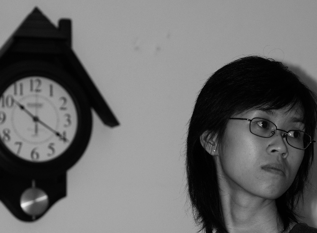
| Shadows and artifacts are distracting. Expression on her face would have been better had she been on the other side of the pci |
|
|
|
01/29/2006 10:45:02 PM |
| well this is a pix, minimalistic feel, negative space in wrong part of frame, b&w need help, light flat, flow of image is confusing, comp needs help, overall try again |
|
|
|
01/26/2006 05:27:11 AM |
|
|
|
01/23/2006 08:39:01 PM |
| There are some strong shadows and some spots right in the middle near to the top |
|
 Photographer found comment helpful. Photographer found comment helpful. |
|
|
01/23/2006 06:29:34 PM |
| what is time up for? I'm not able to tell much from this image. Harsh shadows to the right of the person. Odd spots on the wall inbetween the clock and the woman are distracting. |
|
| Photographer found comment helpful. |
|
|
01/22/2006 03:57:48 PM |
| A little too dark, and the composition is too tight. |
|
| Photographer found comment helpful. |
|
|
01/21/2006 08:46:48 PM |
| Hm. I guess something was scheduled to occur at 10:20. |
|
| Photographer found comment helpful. |
|
|
01/19/2006 09:20:32 AM |
| I'm not sure I get what you're trying to say here. You're referring to the time but the clock is out of focus. |
|
|
|
01/18/2006 11:55:04 AM |
| I like the idea but I think the 2 subjects should be close together more in the middle of the frame. I find how they are each partly out of shot quite distracting. |
|
| Photographer found comment helpful. |
|
|
01/17/2006 10:23:57 PM |
| This image would benefit from a better composition and contrast. Not sure what the focal point is. The crop feels a bit awkward. |
|
| Photographer found comment helpful. |
|
|
01/17/2006 09:51:33 PM |
| little dark.. .distracting spots on wall/dirt on lens |
|
| Photographer found comment helpful. |
|
|
01/16/2006 07:53:59 PM |
| You normally do not want the subject looking out of the frame. If the head and clock were swapped, it would probably look much better. |
|
| Photographer found comment helpful. |
Home -
Challenges -
Community -
League -
Photos -
Cameras -
Lenses -
Learn -
Help -
Terms of Use -
Privacy -
Top ^
DPChallenge, and website content and design, Copyright © 2001-2026 Challenging Technologies, LLC.
All digital photo copyrights belong to the photographers and may not be used without permission.
Current Server Time: 02/01/2026 11:52:28 AM EST.