| Author | Thread |
|
|
01/04/2006 09:18:17 PM |
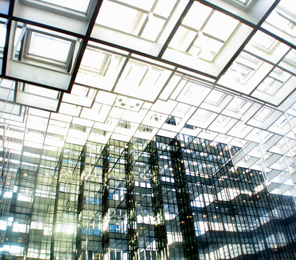
| Because this picture appears to be something I'd expect to see in a generic stock photography catalog, conveys no emotion, and is fairly bland, I'm tempted to give you a 10. However, your valiant attempt at creating high-quality stock photography contains BLOWN HIGHLIGHTS which offends me so I am leaning towards giving you a 1. But then it doesn't really matter, as voting has ended. |
|
Comments Made During the Challenge  |
|
|
01/03/2006 11:01:40 AM |
| Looks like you had enough light that you could have gone done a few stops and avoided the blow out that is predominant in this. It distracts from the great lines and patterns. |
|
 Photographer found comment helpful. Photographer found comment helpful. |
|
|
01/01/2006 11:27:13 AM |
| This pattern did realy grab my attention! |
|
|
|
12/31/2005 04:59:29 PM |
| Great eye. I wish you focused on a smaller sqares. They are giving more interesting patern. 8. |
|
| Photographer found comment helpful. |
|
|
12/31/2005 02:41:08 AM |
| Great patterns here................................. |
|
|
|
12/30/2005 08:13:42 PM |
| this reminds me of the movie "cube". great shot. |
|
|
|
12/30/2005 07:55:40 AM |
| pity this wasn't sharper. focus really lets an excellent shot down. Please try this again and perhaps use a tripod as it would make an excellent print. 8 for subject. 2 for delivery. |
|
| Photographer found comment helpful. |
|
|
12/30/2005 12:16:04 AM |
| Pretty patterns, but looks a little blown out on my screen.... |
|
| Photographer found comment helpful. |
|
|
12/29/2005 06:44:54 PM |
| WoW ! What a find. I had to come back and re-study this. Really like the bright glare in a few spots and the darker shadows in others. Because of the unique imaginative find and the modernistic feel this has I say "10" |
|
| Photographer found comment helpful. |
|
|
12/29/2005 05:59:51 PM |
I think I would've used a square crop, as well as given this a border. I think that would have even driven the square theme further.
Something seems not *quite* right with the exposure. But I like it. Nice entry and well done. |
|
| Photographer found comment helpful. |
|
|
12/29/2005 02:32:35 PM |
|
|
|
12/29/2005 01:49:09 AM |
| This is a good shot, although I find the lighting to be very distracting. Maybe if you took it later in the day when the lighting wasn't so harsh it would have been better. Maybe even in B&W. |
|
| Photographer found comment helpful. |
|
|
12/28/2005 09:28:33 PM |
| very interesting, my eyes are getting confused which way is up, great job |
|
|
|
12/28/2005 01:03:59 PM |
| Pity about the blown highlights. This is still a very nice image. |
|
| Photographer found comment helpful. |
|
|
12/28/2005 08:50:14 AM |
Very interesting subject. Unfortunately it is a little confusing to the eye. But you do get an extra point from me for using my favorite word. PLETHORA is just so fun to say :D. 6.
L8r, |
|
| Photographer found comment helpful. |
Home -
Challenges -
Community -
League -
Photos -
Cameras -
Lenses -
Learn -
Help -
Terms of Use -
Privacy -
Top ^
DPChallenge, and website content and design, Copyright © 2001-2026 Challenging Technologies, LLC.
All digital photo copyrights belong to the photographers and may not be used without permission.
Current Server Time: 02/01/2026 12:12:56 PM EST.