| Author | Thread |
|
|
01/07/2006 08:48:13 AM |
***Greetings from Critique Club***
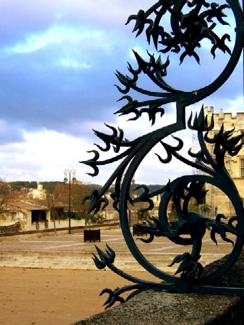
When looking at your photo, I'm puzzled. Composition is good, it fits the challenge and is mostly well exposed and your focus is dead on. You obviously knew what you were doing when taking the shot.
What puzzles me is the pixelation. Did you have troubles with resizing the image? If so, PM me and I'll point you to some tutorials.
One other thing that could have given your photo a little pop. Fill-flash in the foreground could have made the detail in the iron work and wall stand out more IMO.
Work on your resizing techniques and I believe you are on the right path to suceess here.
Leroy |
|
Comments Made During the Challenge  |
|
|
01/03/2006 07:49:09 AM |
| This is another simple but effective composition - almost gothic with the strong metal scroll dominating the softer shapes of nature. |
|
|
|
01/02/2006 09:26:12 AM |
| I like it - Maybe you should've tried taking it at such an angle to cut away the backgound and leave only he sky as background. Would've improved your contrast. |
|
|
|
12/31/2005 12:12:03 PM |
| Nice iron piece but there appears to be a severe case of the jaggies on the edges. |
|
|
|
12/29/2005 12:40:55 AM |
| Should be more crisp but still a good idea. |
|
|
|
12/28/2005 11:54:16 PM |
| Good try, I am finding though that the picture really lacks any focal point of interest, looks a bit like a quick vacation snapshot (5) |
|
|
|
12/28/2005 09:10:27 PM |
| Closer on just the iron and I think this could be a high scorer |
|
Home -
Challenges -
Community -
League -
Photos -
Cameras -
Lenses -
Learn -
Help -
Terms of Use -
Privacy -
Top ^
DPChallenge, and website content and design, Copyright © 2001-2025 Challenging Technologies, LLC.
All digital photo copyrights belong to the photographers and may not be used without permission.
Current Server Time: 04/08/2025 12:59:02 PM EDT.