*Critique Club*
Per your request, here is your in depth critique from the Critique Club.
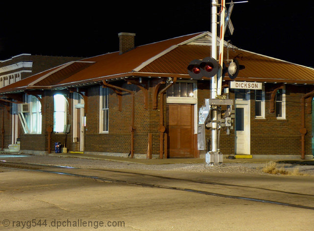
Without the title, I don't think this fits the challenge at all. It's more like 'nighttrainSTATION'. By looking at the image alone, I would never have guessed this was nighttrain.
The focus looks very sharp, which is good, but there's a lot going on in the photo and the clarity of it all almost gets lost. The bricks, the roof, the ground and the large pole near the center makes for a lot to look at, especially with the clashing textures and patterns. Not your fault, but maybe not the most photogenic building if you know what I mean.
Lighting is ok. Seems that there must have been a lot of light around in order to get the entire building in the light like that, but we don't see the source of the light or many shadows. The sky being totally black is not distracting.
There are a couple of window that seem very very bright and are a bit of a distraction. While I think you did a good job with focus, the subject just doesn't hold my interest well. I really think the busy-ness of the photo hurts it in my opinion.
~Heather~ |