| Author | Thread |
|
|
01/08/2006 06:13:54 PM |
| It will not get boring because of the 'movement' it has. The pattern and lines create the idea of movement when you let your eyes go over the picture. I see I gave it a 7 but now think it should have been more, sorry. |
|
 Photographer found comment helpful. Photographer found comment helpful. |
|
|
01/08/2006 05:41:15 PM |
***Greetings from Critique Club***
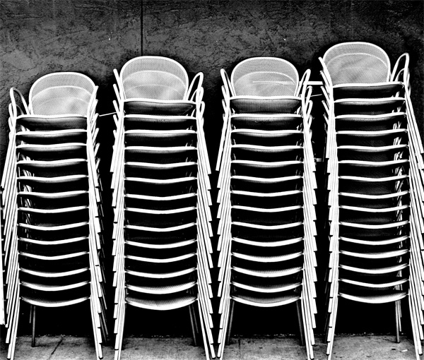
Wow, I get to critique one of my favorite images in the challenge. You've taken something that is rather boring and made it interesting. Good Job! This is what photography as art is about.
Technically, you've created a good image here. Focus is sharp. Exposure is good and lighting is interesting. Compositionally, I doubt I'd change anything about your image.
I admire your use of high contrast black and white. I believe it makes this photo.
I really am unable to tell you much about how to improve it. Perhaps the crop is a little tight, but not so tight that it harms the image much. Perhaps you could have given it a little more pop with a low angle or high angle of view ... give the voters a little WOW to get them going.
Overall, you've created a good piece of art here and crossed 5.9 in only your second challenge. Good work! You're gonna do well here. I can't wait to see more from you.
Take care,
Leroy |
|
| Photographer found comment helpful. |
Comments Made During the Challenge  |
|
|
01/03/2006 10:45:51 PM |
| This reminds me of the Marathon Grill at 19th and Market in Philly. The have the chairs set up on the wall there when not in use. The wall looks different here. Like the pattern...could have made a fine abstract by closing in on the stacks and shooting at an angle...but that's probably just me. Nice find. |
|
|
|
01/03/2006 04:09:47 PM |
plain and effective
i really like it! |
|
| Photographer found comment helpful. |
|
|
01/02/2006 01:24:05 PM |
| Very interesting - Pfoto seems a bit "long" to me - kinda overpowering. Good contrast though. It might've been better making the chair towers shorter and bring the line on the wall in more. (that is just my humble opinion - the way I see it - feel free to tell me to go to hell - very much a beginner at this. |
|
| Photographer found comment helpful. |
|
|
12/31/2005 06:40:03 PM |
| one of my favorites this challenge - good eye for this scene - different heights keep it interesting. |
|
| Photographer found comment helpful. |
|
|
12/31/2005 02:31:52 AM |
| Good idea, good photo...................... |
|
| Photographer found comment helpful. |
|
|
12/29/2005 01:48:37 PM |
| Makes a very nice abstract...perfect in B & W...it has a nice rhythm to it...nicely seen. |
|
| Photographer found comment helpful. |
|
|
12/29/2005 02:08:05 AM |
| My favorite so far, after getting about 75% through the entries. One of those simple everyday kind of scenes that you don't really think about until you see it like this. |
|
| Photographer found comment helpful. |
|
|
12/28/2005 10:39:52 PM |
| Nice use of BW and excellent placement of the interesting linear elements. A very nice image. |
|
| Photographer found comment helpful. |
|
|
12/28/2005 12:42:55 PM |
|
| Photographer found comment helpful. |
|
|
12/28/2005 12:00:42 PM |
|
| Photographer found comment helpful. |
|
|
12/28/2005 09:15:59 AM |
| I think an angle view of this would have given it more "zip". |
|
| Photographer found comment helpful. |
Home -
Challenges -
Community -
League -
Photos -
Cameras -
Lenses -
Learn -
Help -
Terms of Use -
Privacy -
Top ^
DPChallenge, and website content and design, Copyright © 2001-2026 Challenging Technologies, LLC.
All digital photo copyrights belong to the photographers and may not be used without permission.
Current Server Time: 02/01/2026 05:41:31 AM EST.