| Author | Thread |
|
|
01/02/2006 05:40:18 PM |
** Greetings from the Critique Club **
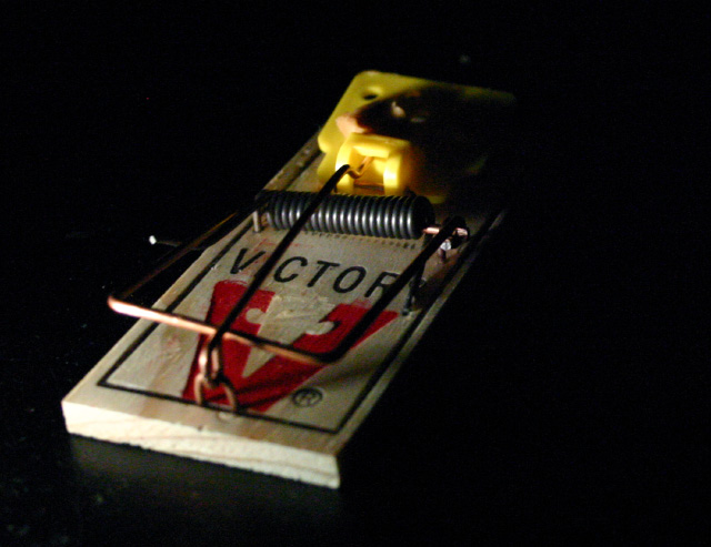
I honestly do not feel the focus being on the word Victory came across clear enough to get people to understand how this fit the challenge. After all, the image was supposed to convey the fear - not the remedy.
Technically, the lighting needs improvement as the harsh shadow off the cheese is distracting being in sharp contrast to the blown out cheese. The poor lighting would also account for the grain/noise of your background. I would have liked to see better focus overall.
- Linda |
|
Comments Made During the Challenge  |
|
|
12/27/2005 04:15:02 AM |
| Your photo is coming across as a grainy on my screen. Not a bad setup. I like the lighting. One point deducted for not having phobia name mentioned in title as dictated by challenge. |
|
|
|
12/26/2005 01:46:39 AM |
| Great lightling. That you can't see the back of the trap really conveys being at the edge of a dark world of scary critters. Very creative. |
|
 Photographer found comment helpful. Photographer found comment helpful. |
|
|
12/24/2005 07:01:31 PM |
| Doesnt really show a phobia...and it is a lil out of focus |
|
|
|
12/24/2005 06:19:12 AM |
|
|
|
12/22/2005 01:43:51 AM |
| Should have been in puns ... |
|
|
|
12/21/2005 02:04:21 PM |
| Good lighting but lack of focus hurts |
|
|
|
12/21/2005 01:31:12 PM |
|
|
|
12/20/2005 11:06:39 PM |
| Now lemme think ... this looks familiar |
|
|
|
12/20/2005 09:44:58 PM |
| I see the mouse trap and I see the title... but there is no one here to be afraid of a mouse. |
|
Home -
Challenges -
Community -
League -
Photos -
Cameras -
Lenses -
Learn -
Help -
Terms of Use -
Privacy -
Top ^
DPChallenge, and website content and design, Copyright © 2001-2025 Challenging Technologies, LLC.
All digital photo copyrights belong to the photographers and may not be used without permission.
Current Server Time: 04/08/2025 08:03:26 AM EDT.