I saw your note on Larus' message and secided to up the @ comment shot.
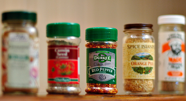
OK I gave this a 5 though it could have gone to a six. The table seems to be running away from the camera, and the BG is not evenly lit, so the spaces between the spices and around your subject take up nearly as much real estate as the subject. If the bottles had been pushed closer together so as to slightly overlap, you would have ended up with a more square, and therefore larger picture, with less dead space.
The lighting, DOF and colors are good, but the glare off the glass is a bit much ( wiping the glass with slightly soapy water can give a more matt look to glass ) and for no good reason the two green caps of almost the exact same color really pull my eye off to the left, and acentuate the V of empty space above the jars. I have mostly complained about the issues I see rather than compliment what is right, this isn't a bad shot, just not a strong one. |