| Author | Thread |
Comments Made During the Challenge  |
|
|
07/06/2003 03:06:09 PM |
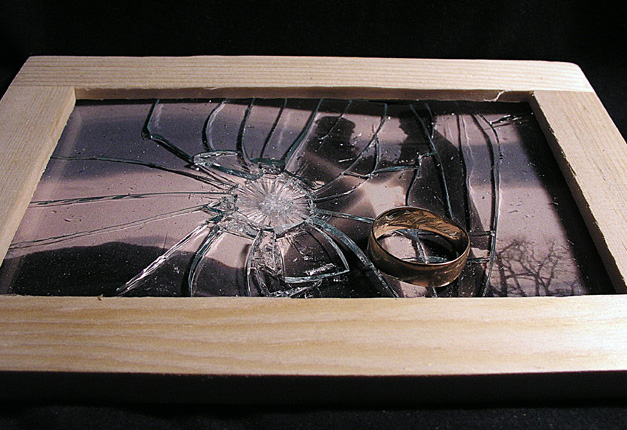
| This is much too staged and cliche for me. Sorry. |
|
|
|
07/06/2003 03:00:04 PM |
| Nice play on the subject. It took a few minutes to realize the couple in the background. |
|
|
|
07/06/2003 01:49:30 PM |
| Tragedy and a clever title/idea! Nice arrangement and composition. |
|
|
|
07/04/2003 03:57:27 AM |
| Don't think this works for the competition, but nice photo in any case. |
|
 Photographer found comment helpful. Photographer found comment helpful. |
|
|
07/02/2003 02:33:50 PM |
| I like the idea, but the smashed glass is a little distracting. I do like that it's smashed, but somehow, it seems like it would be more effective if it were just cracked, or if it were easier to discern that there are two people in the photo frame. Good idea. |
|
| Photographer found comment helpful. |
|
|
07/01/2003 11:49:06 AM |
| Very good idea, slightly let down by the exposure on the right. |
|
| Photographer found comment helpful. |
|
|
07/01/2003 07:38:20 AM |
|
|
|
07/01/2003 07:26:26 AM |
| Nice shot, great idea... might have looked even better in a more homely setting (like on a living room table) as opposed to the black backdrop... should still do well here. Good luck - 8 |
|
| Photographer found comment helpful. |
|
|
07/01/2003 05:03:56 AM |
| I wonder if this would have worked better with the shot taken from directly above, asthe cut off frame doesn't look quite right, also the left edge is trimmed a little more than the right - would have preferred it if they were a little more even |
|
| Photographer found comment helpful. |
|
|
06/30/2003 11:03:00 AM |
| I this would of been better without the frame..changing the composition a bit. Nice try, and nice idea. |
|
| Photographer found comment helpful. |
|
|
06/30/2003 09:47:15 AM |
| Great idea (would also work well with the "unanswered questions" challenge, I think. I like the "darkness" of the shot as it helps to set the mood. I don't like the framing as well though -- it feels "cut off" to me. |
|
| Photographer found comment helpful. |
|
|
06/30/2003 04:08:56 AM |
| Very poignant shot. Such a great concept. But... it's a huge shame it wasn't carried off better... the glare on the frame detracts, the lighting in general seems a bit harsh. It looks like only one near light source was used, which casts unappealing shadows. I'd have liked to see the whole frame included, and a better background used. The current background accentuates the noise caused by shooting in low light. Perhaps if the photo was slightly rotated as well, to imply that it had been thrown down, rather than placed by a photographer. |
|
| Photographer found comment helpful. |
|
|
06/30/2003 12:35:00 AM |
| nice. might be better without the ring, it doesn't need to be made that obvious |
|
|
|
06/29/2003 08:51:46 PM |
| Ouch. Sorry if this was for real. Good entry, though. |
|
Home -
Challenges -
Community -
League -
Photos -
Cameras -
Lenses -
Learn -
Help -
Terms of Use -
Privacy -
Top ^
DPChallenge, and website content and design, Copyright © 2001-2025 Challenging Technologies, LLC.
All digital photo copyrights belong to the photographers and may not be used without permission.
Current Server Time: 04/07/2025 01:26:10 AM EDT.