| Author | Thread |
|
|
07/03/2002 08:58:00 AM |
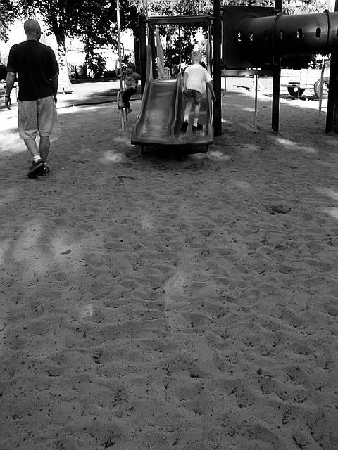
Well, thanks for the comments. I'm happy that some voters could see what I wanted to express on my picture.
For those who could see my intention clearly, here is a brief explanation.
CITY: well the playground is a characteristic of small to large cities. You rarely find it in rural areas.
LIFE: this is more difficult to capture. In the picture, I tried to capture life via the footsteps in the large foreground. It is 'life' that has passed, and this fact is signified by the people facing away and walking away from the picture. |
|
Comments Made During the Challenge  |
|
|
06/30/2002 06:54:00 PM |
| I think you need more light for the black and white to work -- it's much too dark. |
|
|
|
06/30/2002 06:46:00 PM |
| Good use of black and white, cropped a little too tight at the top, in my opinion. |
|
|
|
06/29/2002 03:39:00 PM |
| I hope people don't complain too much about this not fitting the theme because it does. Well composed, good use of negative space. |
|
|
|
06/29/2002 01:26:00 PM |
| In and of itself, a playgorund doesn't say "city life" to me, and the lighting, shadows of composition turn me off as well. 3 sjgleah |
|
|
|
06/27/2002 11:45:00 PM |
| Very interesting composition, nice use of black and white. Churned up sand like that is a transient sign of life, so many mingled footprints, making it dominate the photo is a cool idea. |
|
|
|
06/27/2002 08:06:00 PM |
| great photo for black and white, at first i thought you should have gotten less sand, but then i see how you needed it to relate to your title, i like it alot. |
|
|
|
06/26/2002 10:40:00 AM |
IMO too much "beach". Overall, shot is hard to view, to see what all is going on. Three subjects, two backs and one very hard to see.
Photo 5 City 7 total 6 |
|
|
|
06/26/2002 09:35:00 AM |
| I do not particularly like the balance of this crop, or the washed out areas. Why is everyone facing away from the camera? |
|
|
|
06/25/2002 07:45:00 PM |
| A nice picture but a little static. |
|
|
|
06/25/2002 02:03:00 PM |
| Dark, but not moody. A lot of foreground, with no particular appeal to it. Interesting that the models are mostly facing away from the camera, but I don't see any message to that. |
|
|
|
06/25/2002 12:56:00 PM |
| The overall quality of this photo is good. I'm curious as to why you chose black and white? I like this particular perspective with the empty sand in the foreground.. I normally wouldn't but the texture of the sand is nice. = 7 - jmsetzler |
|
|
|
06/24/2002 02:26:00 PM |
| great use of negative space! |
|
|
|
06/24/2002 01:21:00 PM |
| I think there's too much space in the foreground for this to work. |
|
|
|
06/24/2002 01:12:00 PM |
| I like the footprints in the sand - they show the scene as having a lot more "life" than the moment this was captured. |
|
|
|
06/24/2002 08:54:00 AM |
|
|
|
06/24/2002 07:47:00 AM |
|
|
|
06/24/2002 05:23:00 AM |
| what a beach you got there! |
|
Home -
Challenges -
Community -
League -
Photos -
Cameras -
Lenses -
Learn -
Help -
Terms of Use -
Privacy -
Top ^
DPChallenge, and website content and design, Copyright © 2001-2025 Challenging Technologies, LLC.
All digital photo copyrights belong to the photographers and may not be used without permission.
Current Server Time: 04/09/2025 01:42:12 PM EDT.