| Author | Thread |
Comments Made During the Challenge  |
|
|
07/06/2003 05:03:23 PM |
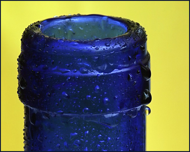
| Super macro. Interesting lines and drops make for an engaging image! 9 |
|
 Photographer found comment helpful. Photographer found comment helpful. |
|
|
07/05/2003 08:49:13 AM |
| The colours work really well together, the added condensation is a nice effect (compared to a plain bottle neck)... givent the relative size of the bottle compared to the whole frame I think it would have looked better more centred. |
|
| Photographer found comment helpful. |
|
|
07/04/2003 08:58:15 PM |
| nice image off-centre framing lets it down |
|
| Photographer found comment helpful. |
|
|
07/03/2003 11:33:42 PM |
| Nice detail. I like that I feel this shot - cool and wet. |
|
| Photographer found comment helpful. |
|
|
07/02/2003 05:51:56 AM |
| Its a nice shot and good use of background colour, but being off centre just doesn't look right to me |
|
| Photographer found comment helpful. |
|
|
07/01/2003 12:14:56 PM |
| Great focus and detail. I also like the contrast between the blue and yellow. I think it needs to be cropped just a touch more on the right, as it feels a bit unbalanced to me, or give it more "space" around the right and top. Right now, it is just barely off of center, adn it makes it look "accidental," I think. |
|
| Photographer found comment helpful. |
|
|
06/30/2003 07:40:15 PM |
| excellent close up, the water dropplets add alot. I think i would have used a pastel for the back round. |
|
| Photographer found comment helpful. |
|
|
06/30/2003 01:50:02 PM |
| Good color and contrast, excellent sharpness and great texture on the water drops. But I'm wondering about the composition. It's too off-center to be considered centerd and not off center enough to be off-center. It just doesn't look right to me... |
|
| Photographer found comment helpful. |
|
|
06/30/2003 01:12:08 PM |
|
| Photographer found comment helpful. |
|
|
06/30/2003 11:30:12 AM |
|
| Photographer found comment helpful. |
|
|
06/30/2003 10:08:19 AM |
| Some delicious colours and textures here, but a strange composition... I'd have prefered more white space to the right. Beautifully lit, great saturation. Dof is spot-on. With more effective use of cropping and white space, this could have got a 10. Instead: 8 |
|
| Photographer found comment helpful. |
|
|
06/30/2003 03:37:33 AM |
| Bold and bright. Could perhaps use a tad more sharpness, but good nonetheless. Well done. |
|
| Photographer found comment helpful. |
|
|
06/30/2003 03:10:11 AM |
| great subject. Not a fan of the blue+yellow. |
|
| Photographer found comment helpful. |
|
|
06/30/2003 01:01:13 AM |
| Nice use of colors here. The water drops add some interesting texture. Works well for me. |
|
| Photographer found comment helpful. |
|
|
06/30/2003 12:34:39 AM |
| very good controll of the DOF and amazing contrast an 8 |
|
| Photographer found comment helpful. |
Home -
Challenges -
Community -
League -
Photos -
Cameras -
Lenses -
Learn -
Help -
Terms of Use -
Privacy -
Top ^
DPChallenge, and website content and design, Copyright © 2001-2026 Challenging Technologies, LLC.
All digital photo copyrights belong to the photographers and may not be used without permission.
Current Server Time: 02/01/2026 10:27:07 AM EST.