| Author | Thread |
|
|
12/20/2005 04:24:20 PM |
Greetings from the Critique Club
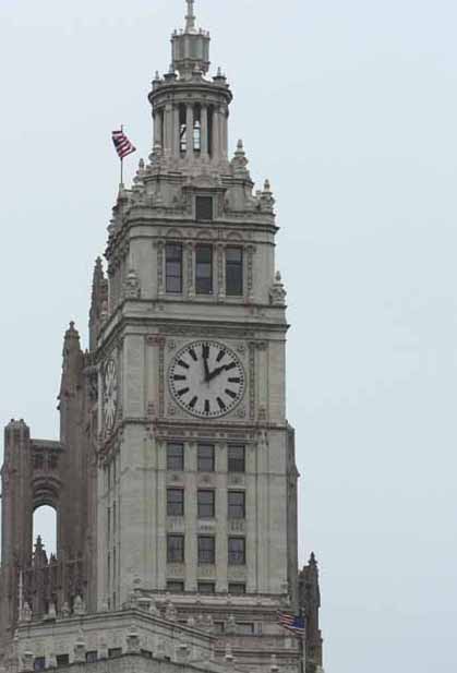
Hello! Yes, this image meets the challenge nicely as you were undoubtedly going for the 2:00 time (and too early for it).
I do have a couple of suggestions for you. In compostion, you might try moving your camera so that the tower has a little space on all sides. That left edge is a bit cramped, while the right side has more than enough space. And, if you can, try to include all of the tower in the shot - including that spire!
Then, you have good detail, but this image could use some contrast. If your camera supports bracketing, try taking pics over and under the 'official reading'. In this instance, I have a suspicion that this image would be improved lots by underexposing a stop or two.
You're getting there. Lots of practice and a good understanding of your camera will get you far. So keep shooting! I'll look forward to seeing more of your work on DPC.
Alice. |
|
 Photographer found comment helpful. Photographer found comment helpful. |
Comments Made During the Challenge  |
|
|
12/12/2005 06:44:26 AM |
| Two minutes too early for what? Without the title this shot doesn't say much to me about the challenge. The clock itself just isn't enough to indicate a mood of any sort. Strictly in terms of image quality, this is very poor, even for myself, never a stickler for a perfect digital image. Compositionally, it is a little better in that it captures the subject matter without a lot of distracting details like power lines, etc. Unfortunately, there is a bit too much drab sky in the background. Nearly 2/3 of the frame is taking up with washed out white skyline. The building looks oddly flat which is strange for such an architecturally detailed structure. I'm beginning to suspect that this was taken with the digital zoom so that you could get a shot of the clock hands. I think this would be the culprit behind the flatness of the picture plane and the extreme noise. The clock just isn't a captivating enough subject to make it worth sacrificing so much image quality by using digital zoom. |
|
|
|
12/11/2005 09:55:11 AM |
|
|
|
12/11/2005 03:01:48 AM |
| To show a tower with a clock is not very required like subject. That resembles architecture more |
|
|
|
12/08/2005 07:44:26 PM |
| kind of dull, slightly out of focus |
|
|
|
12/08/2005 05:41:58 PM |
| I'd have liked to see a closer crop on the clock. |
|
|
|
12/08/2005 11:19:59 AM |
| would like to see more of this building and it is one minute too early, not two.. also out of focus. 2. |
|
|
|
12/08/2005 04:57:53 AM |
| Nice composition, could be improved with levels and/or brightness/contrast adjustment. |
|
|
|
12/07/2005 02:19:30 PM |
| with colors this muted b&w would have been better in my oppinion |
|
|
|
12/07/2005 09:44:38 AM |
|
|
|
12/07/2005 02:25:07 AM |
The image is a little washed out - needs a contrast boost
You also chopped off the top and bottom of the building - which leaves it sort of stranded - no strong base to the image. |
|
|
|
12/07/2005 02:10:59 AM |
| You can't be more exact than that, it says it all. |
|
|
|
12/06/2005 09:06:40 PM |
| It's too grainy. I like the concept going on, but it's not captured very well. If this were taken in a more contrasting sky compared to the building I would have rated this a bit higher. The focus isn't all that great. So I gave this a 4. |
|
Home -
Challenges -
Community -
League -
Photos -
Cameras -
Lenses -
Learn -
Help -
Terms of Use -
Privacy -
Top ^
DPChallenge, and website content and design, Copyright © 2001-2025 Challenging Technologies, LLC.
All digital photo copyrights belong to the photographers and may not be used without permission.
Current Server Time: 04/07/2025 01:34:33 AM EDT.