| Author | Thread |
|
|
12/13/2005 06:46:06 PM |
Greetings from the Dead Critics Society!
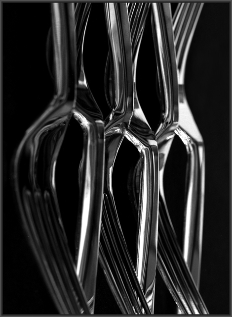
There is much to like about this photograph. It's a very absorbing study of tone and shape, and the minimalist lighting was well chosen to accentuate those two qualities of the subject - tone and form. Several commentators endorsed your achievement in that respect.
Another comment, perhaps the most interesting and perceptive of all, applauded the "misleading" nature of the effect you have achieved. By this she clearly meant that the subject forks were presented in a way that disguised their identity, at least at first glance, but which instead revealed something important about their true nature or "personality" ... i.e. their clean, elegant lines, especially when seen as a group.
There are several things you have done to accomplish that in addition to the lighting; there's the top-and-tail arrangement of the forks, the cropping to exclude the tips and handles, and the rotation of the image to provide a less familiar viewpoint.
The result is two things. First, ambiguity. Ambiguity is always good in an artwork, because it forces into gear the brain of even the most lazy of viewers (well, maybe not literally the most lazy, otherwise this would have appeared on the first page of the challenge results). Second, it reveals and celebrates an essential quality of the subject that we would probably have overlooked had it been instantly apparent that we were just looking at half a dozen forks. My first guess, if I were seeing this image without the context of the challenge topic, would have been some kind of fine glassware.
Possibly a greater depth of field may have satisfied those viewers who need to see everything in focus to avoid 'distraction'. It may even have thereby resulted in a higher score for this thoughtful image, but I'm not sure that would have added anything to the considerable artistic merits of your work.
And that's the point of my critique. Those photographic pedants with elaborate equipment and perfect technique may feel they could take a better photograph of forks. But what they would be failing to understand is that yours is a photograph about forks. |
|
 Photographer found comment helpful. Photographer found comment helpful. |
Comments Made During the Challenge  |
|
|
12/11/2005 12:44:22 PM |
| Looks like a 50's car grille. Very nice. |
|
| Photographer found comment helpful. |
|
|
12/09/2005 01:28:58 AM |
|
| Photographer found comment helpful. |
|
|
12/08/2005 06:34:50 PM |
| I like the composition, would like to have seen lighting on the forks in the foreground, and, perhaps a bit clearer focus and depth-of-field. |
|
| Photographer found comment helpful. |
|
|
12/08/2005 02:36:29 PM |
| A very nice b/w study with that abstract feel. |
|
| Photographer found comment helpful. |
|
|
12/08/2005 09:17:53 AM |
|
| Photographer found comment helpful. |
|
|
12/08/2005 04:01:19 AM |
|
| Photographer found comment helpful. |
|
|
12/05/2005 07:43:34 AM |
| I like the way the lines of the forks are a bit misleading. but I'm not sure about the compo really |
|
| Photographer found comment helpful. |
|
|
12/05/2005 04:18:31 AM |
| Very nice, love the lines and the reflections. |
|
| Photographer found comment helpful. |
Home -
Challenges -
Community -
League -
Photos -
Cameras -
Lenses -
Learn -
Help -
Terms of Use -
Privacy -
Top ^
DPChallenge, and website content and design, Copyright © 2001-2025 Challenging Technologies, LLC.
All digital photo copyrights belong to the photographers and may not be used without permission.
Current Server Time: 04/07/2025 02:02:34 PM EDT.