| Author | Thread |
|
|
12/08/2005 04:12:42 PM |
You are a member - I'd be interested in seeing this at 640 width (if possible) posted in your portfolio. I like the colors and think it has potential bigger. edit: thank you for posting the other version, I left a comment
Message edited by author 2005-12-17 17:43:38. |
|
 Photographer found comment helpful. Photographer found comment helpful. |
Comments Made During the Challenge  |
|
|
12/07/2005 10:16:15 PM |
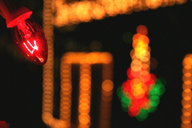
| Hmm....needs to be bigger so we can see more detail. I would also try to get a little "wider" on the background. |
|
|
|
12/07/2005 03:20:36 PM |
|
|
|
12/07/2005 11:35:15 AM |
| Oh, size... but you know that by now. The lightbulb in teh top left corner is in focus, but it hardly occupies enough of the image to complement the huge area of OOF lights. The idea for the study is good, and I am not scoring this low just because it is blurry - rather because it failed to use the blur in a eye-pleasing manner (at least in my opinion). |
|
|
|
12/06/2005 08:44:53 PM |
| Too small! I can't see the details. |
|
| Photographer found comment helpful. |
|
|
12/05/2005 10:27:43 AM |
|
|
|
12/04/2005 03:05:53 PM |
| Use the maximum size available, your photo will fare much better. To me, even though the one lightblub is sharp, the out of focus background dominates, with the lines being in contrast to what I imagine from Xmas decoration. The multi-color item is nice. Overall, I think I, as the user, am confused what the subject of the image is. |
|
| Photographer found comment helpful. |
|
|
12/04/2005 02:09:14 AM |
| Just not that eye-catching....sorry! |
|
|
|
12/04/2005 01:09:05 AM |
| Good luck on your entry............ |
|
|
|
12/03/2005 08:33:27 PM |
| There are several things that will get this one low votes. It is out of focus, you can't tell what it is, and it is a little too small. Its a good idea to stay close to the 640 diminsion limits. |
|
|
|
12/03/2005 12:34:12 AM |
| A step outside the square,find it hard to find POF .... |
|
| Photographer found comment helpful. |
|
|
12/02/2005 10:55:29 AM |
| A bigger image might have been better, zooming in on the bulb. As is, the bulb is almost lost overshadowed to a large degree by the blurred lights. |
|
|
|
12/02/2005 07:37:11 AM |
|
|
|
12/02/2005 02:02:23 AM |
| You are kidding of course, there is nothing clear about this image. |
|
|
|
12/01/2005 11:40:39 PM |
| 2 - This looks like it has good potential at 'full size', but; Criticism; needs to be 'full size', 640 width in this case. Nice colors and bokeh effect, what I can discern. |
|
| Photographer found comment helpful. |
|
|
12/01/2005 11:41:59 AM |
| I got out my magnifying glass and I found your photo - yay! |
|
|
|
12/01/2005 10:52:53 AM |
|
|
|
12/01/2005 09:42:30 AM |
| This photo is much too small. Seems to be a nice shot though. |
|
| Photographer found comment helpful. |
|
|
12/01/2005 09:20:05 AM |
| Needs to be bigger so we can "see" it better. |
|
| Photographer found comment helpful. |
|
|
12/01/2005 03:17:57 AM |
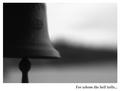
| clever title and I have to say the small image size adds to it! (which I'm sure others will disagree with!) 8 |
|
| Photographer found comment helpful. |
Home -
Challenges -
Community -
League -
Photos -
Cameras -
Lenses -
Learn -
Help -
Terms of Use -
Privacy -
Top ^
DPChallenge, and website content and design, Copyright © 2001-2026 Challenging Technologies, LLC.
All digital photo copyrights belong to the photographers and may not be used without permission.
Current Server Time: 02/01/2026 08:09:54 AM EST.