| Author | Thread |
|
|
12/11/2005 11:31:01 AM |
CRITIQUE CLUB CRITIQUE
by karmat
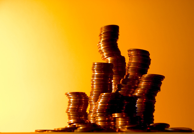
Compositionally, I love how this shot is set up. The stacks snake up and curve almost like they are actually growing. By doing it that way, the shot has "movement" (the eyes are drawn upwards through the stacks) but it is still stable because you have located them primarily on the right third (Though cropping just a bit of the far righ side may have made it a more even third, if that is what you wanted). The apparent randomness also adds appeal to me for this shot.
Technically, the orange background is awesome. I also like how it "fades" from yellow to orange. I do think if the focus was a bit sharper on the pennies throughout it would have had more punch. While I certainly understand that not all of the subject *needs* to be in focus, I think what happens in this shot is that the eyes are pulled towards the fuzzier ones.
Overall, I find this shot very appealing. I would have expected a higher score for it. Crawling inside the head of a typical dpc voter (yes, it is scary sometimes), pocket change is everyday, and while presented in a unique way, it still lacks something that many people can identify with. What you have done compositionally is awesome, but it takes a second or third glance to realize the beauty of it.
Great work, and best to you in future challenges.
karmat |
|
|
|
12/06/2005 09:12:47 PM |
| liked it josh, scored it a 6 and thought it would finish well |
|
Comments Made During the Challenge  |
|
|
12/06/2005 05:01:08 PM |
| Great composition of the subject for shadows and reflections |
|
|
|
12/06/2005 04:14:12 PM |
| the background works well with this image. like how the stacks of pennies are not straight. nice job! |
|
|
|
12/06/2005 01:34:03 PM |
| Great harmony of colors... |
|
|
|
12/06/2005 09:50:39 AM |
| Love the gradation in the background, and the not straight stacks...fun line. |
|
|
|
12/06/2005 07:50:07 AM |
| Love the tones here and the sway back and forth of the stacks. |
|
|
|
12/04/2005 05:20:02 PM |
| I was thinking of doing something like this! :-) |
|
|
|
12/03/2005 05:56:45 PM |
| i like the way the coins arent in direct lines. However ... what were you going for thirds?? cause to me... it looks more like2.5's |
|
|
|
12/01/2005 07:57:20 PM |
| i love your coloring and your swirving stacks...very cool! |
|
|
|
11/30/2005 07:11:02 PM |
| Well done, thanks for making this colorful so it stands out and is interesting, even for a common idea. |
|
|
|
11/30/2005 07:00:25 PM |
| I would have liked to either see where the stacks hit the table (rather than the out of focus coins scattered about) OR no table at all... |
|
|
|
11/30/2005 06:37:23 PM |
| i like the colors you have used and the balance is great |
|
|
|
11/30/2005 11:26:54 AM |
| nice backround. hope you do well! |
|
|
|
11/30/2005 10:39:03 AM |
| OooO!! the leaning tower of change! nice lighting! |
|
|
|
11/30/2005 08:41:24 AM |
| I like this one!!! It's very appealing to look at. |
|
|
|
11/29/2005 08:38:07 PM |
|