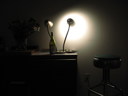
the harsh light of an industrial work lamp is softened when reflected off a blank wall and falls gently on a wine bottle, a bouquet of wildflowers, and an eames era bar stool.
Statistics
Place: 216 out of 223 Avg (all users): 3.9098 Avg (commenters): 4.3333 Avg (participants): 3.4819 Avg (non-participants): 4.1038 Views since voting: 957 Views during voting: 360 Votes: 266 Comments: 12 Favorites: 1 (view)
::: Critique Club ::: Grace, welcome to DPC and the Critique Club. This is very cool to be asked to critique a first ever entry.
First Impression - the most important one: There is something alluring about low-light shots like this, they require the viewer to explore the image and engage with it, to peer into the shadows and corners for the story it's telling. On the other hand, make it too hard to see and they will not bother, vote negatively and just pass on.
Composition: The image is too small and that makes it hard for people to study the detail. I've discussed that further down. Have you cropped this at all since it's still in the 1.333 camera ratio? It doesn't look like it, You can change a lot about the way your image looks by doing that and you don't need expensive photo editing software either.
Composition is about leading the eye into an image (painting or photo). Research shows that the eye enters bottom left and travels up to top right ("Leading Lines Rule"). Once in there, the same research tells us that the eye finds comfort when the point of interest (POI) sits on a thirds line or intersection ("the Rule of Thirds").
In this picture, it's a little difficult to determine what is the main point of interest. The light on the wall is strong and its reflections are tantalising so what we need to do is then get them assembled in frame so that the eye is drawn to them.
A good place to start is in cropping the image to loose any dead space which doesn't add to the photo. Don't be confused by this, but we occasionally suggest that people should have added dead or "neutral" space in an image to give the single simple object a powerful focus. In this case, there is a lot of dead space in the bottom left area which overpowers the image so we can crop that out. I've done an example to show what I mean
(click to enlarge)
Here the image has been cropped to loose the dead space bottom and left while still retaining the flower and its vase. It's OK, but you can see how it does't 'look' right yet. Apart from balance, the wall socket and the flower are distracting. The flower was a great idea but it's just too under-exposed so be brutal with a precious bit if loosing it improves the overall result.
It needs an application of the rule of thirds and some further cropping.
(click to enlarge)
Not perfect, but I hope you can see how you can use these tools and rules to dramatically enhance your camera captures.
Subject: While I really like the elements you've introduced into your image, I really can't get "industrial" about it and your commenters were also of the same view. So let's ignore that and work on the image as a stand-alone photo. I just think this has potential and would like to see you re-set it and reshoot it with work on some of the things we've talked about here and post it in your portfolio for comment.
Technical (Colour and light): Size:- Your reduction for DPC is too small to do your entry justice. It's currently 425x319 when it could have been 640x480. The maximum size on any dimension is 640 so make the most of it.
Sharpness:- The smaller the image after reduction, the more sharpness you loose. All camera-sharp images that are reduced to 640x480 require sharpening after reduction, it's just a function of the resizing that it will get fuzzy.
Focus:- It's difficult to be sure, but I am pretty sure that the original will not be sharp and in focus. That's pretty much an essential in this forum, you will just get hammered for being 'lazy' every time in the voting.
Alignment:- Your camera is tilted and so the sideboard is not level. That will loose you points so see if you can get some freeware at least that allows you to rotate by small increments. In this case a right hand rotate of 0.8deg makes all the difference.
Summary: This is a very creative approach to a first submission. It shows you as a photographer who wants to work and paint with light. That might seem obvious to you, but it puts you in the top 20% at least of submitters to DPC. Using light in this way is advanced work and so I encourage you to work with it, experiment, worry it to death, be anal about the small details and dazzle us in the future with a ribbon.
I can almost read the lable on the bottle .... Caution: Consumption during photograpy may result in low scores.
I'm afraid I don't see how this demonstrates industrial, even considering the entertainment industry.