| Author | Thread |
|
|
12/08/2005 03:14:18 PM |
**Critique Club**
Well, this is your first entry so I�m giving you a few tips you might not know until you�ve been here a while.
-Go for the biggest size possible. 640 is the max allowable and some will vote down for a simple thing like a small image.
-When you resize smaller you lose detail. You should always run an USM or Unsharp Mask (or equivalent if not using Photoshop) to bring back that definition. This image looks like it could have especially used it. Nothing seems out of focus, it�s just not as sharp as I�d like to see.
On to the image!
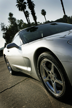
Compositionally, I personally like the angle but am not sure about cutting off the front of the car. Seeing that this is advanced editing I might have even cloned out the crack in the cement but that honestly would have changed the photo. My eye is more drawn to the car with it there.
Color and Lighting- While there are some blown out highlights the USM would have dampened it with the door handle becoming sharper. The sky seems very bleak to me and I would suggest you add some blue to it. You can do this under selective color by adding black or decreasing magenta in the blue and cyan channels. This is legal under basic and advanced editing.
It�s a great image for the challenge and I think you did incredibly well for your first entry. I can�t wait to see what you�ve got coming & good luck in future challenges! |
|
 Photographer found comment helpful. Photographer found comment helpful. |
Comments Made During the Challenge  |
|
|
12/02/2005 03:55:01 AM |
| Very nice picture. I really like the angle you used, adds to the 'sleekness' |
|
| Photographer found comment helpful. |
|
|
11/28/2005 12:58:14 PM |
nicely composed car shot! would have loved to see this taken at sunset for richer light and reflections...
i have to say, though, that the title implies "teenage boy" more than "adult" to me with this image. |
|
| Photographer found comment helpful. |
|
|
11/28/2005 03:28:15 AM |
| I like the perspective of this shot. The focus is sharp as well. My main complaint is that you didnt' utilize the maximum 640 pixels, so the image is a bit small. |
|
| Photographer found comment helpful. |
|
|
11/27/2005 10:32:11 PM |
|
| Photographer found comment helpful. |
|
|
11/27/2005 07:34:59 PM |
| ahh, why so small? this looks like a great picture, it's just not large enough! |
|
| Photographer found comment helpful. |
Home -
Challenges -
Community -
League -
Photos -
Cameras -
Lenses -
Learn -
Help -
Terms of Use -
Privacy -
Top ^
DPChallenge, and website content and design, Copyright © 2001-2025 Challenging Technologies, LLC.
All digital photo copyrights belong to the photographers and may not be used without permission.
Current Server Time: 04/08/2025 05:02:22 AM EDT.