| Author | Thread |
Comments Made During the Challenge  |
|
|
07/01/2003 07:09:29 PM |
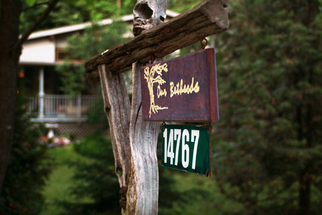
| Nice photo. Shows your opinion of your home. |
|
|
|
06/30/2003 12:37:26 PM |
| the angle of the sign is awkward for the subject of your composition. |
|
 Photographer found comment helpful. Photographer found comment helpful. |
|
|
06/29/2003 12:38:47 PM |
| Would have liked to see the sign placed to one side of the photo. |
|
| Photographer found comment helpful. |
|
|
06/28/2003 07:06:44 PM |
| I would have liked ALL of the sign in focus myself |
|
| Photographer found comment helpful. |
|
|
06/28/2003 05:26:43 PM |
I like this shot, grest composition, good lighting and well focus. Keep it up.
I like it very much and I gave it a 10. Good luck. |
|
| Photographer found comment helpful. |
|
|
06/27/2003 09:01:39 PM |
| not too bad... nothing spectacular here though |
|
| Photographer found comment helpful. |
|
|
06/27/2003 05:47:55 AM |
| cool perspective and DOF. |
|
| Photographer found comment helpful. |
|
|
06/27/2003 12:56:25 AM |
| nice, but probably has more meaning for the owner, that we could not possibly understand |
|
| Photographer found comment helpful. |
|
|
06/25/2003 09:53:34 PM |
| This would have been better from a different angle. |
|
| Photographer found comment helpful. |
|
|
06/25/2003 06:49:46 AM |
|
| Photographer found comment helpful. |
|
|
06/25/2003 06:42:13 AM |
| Good composition, simple but to the point. Very nice. I like it very much! |
|
| Photographer found comment helpful. |
|
|
06/25/2003 05:58:24 AM |
| I don't think the sign should have been dead center in the image. |
|
| Photographer found comment helpful. |
|
|
06/24/2003 09:43:48 PM |
| The focus is annoying. The background is fine, but the letters on the sign seem to need something - a different angle and/or better focus. |
|
| Photographer found comment helpful. |