| Author | Thread |
Comments Made During the Challenge  |
|
|
06/23/2002 11:03:00 PM |
| Creative take on the assignment. To bad the picture wasn't a little clear. I love sharp focus. |
|
|
|
06/23/2002 10:18:00 PM |
|
|
|
06/20/2002 12:33:00 PM |
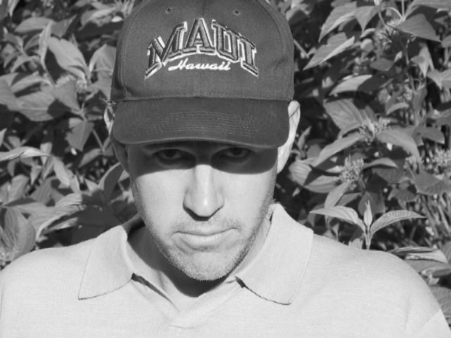
| Nice interpretation :) I believe the exposure is slightly 'warm' on this photo. I would also like it better if the background was a little more out of focus with a smaller depth of field. The crop across the top cutting the top of the hat out of the frame could go either way... I'm not sure which works best, but overall, this may have worked better in a vertical orientation? Good shot! - jmsetzler |
|
|
|
06/20/2002 11:47:00 AM |
| Good interpretation. I think a better composition would have been just on the chin & cheek, maybe with another shadow on part of the image. Here, "Maui" is quite dominant. |
|
|
|
06/19/2002 01:16:00 PM |
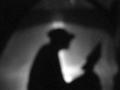
| Please re-read the Challenge. Cute twist/play on words, but I'm not buying.....The shadow on the eyes kinda works, but the underside of his eyes make him look like a ghool. Photo 6 Creativity 5 Shadows 4 total 5 |
|
|
|
06/19/2002 11:42:00 AM |
| mmmmmmmmmm its fun i like it |
|
|
|
06/19/2002 09:04:00 AM |
| nice. only nit is that the head is not in the middle. |
|
|
|
06/18/2002 02:39:00 PM |
| Nice double-inclusion of the theme, and good composition as well. B/W was a good choice. |
|
|
|
06/18/2002 11:45:00 AM |
| kinda sorta an interesting idea but overall composition is just boring. It doesn't do anything for me. Try something different, more dramatic angle, i hate to say differnet lighting because your lighting was specific but it just doesn't do anything for me. |
|
|
|
06/18/2002 01:37:00 AM |
|
|
|
06/17/2002 09:11:00 PM |
| Okay, good tie-in with the challenge. Now, the problem is with the photo. Harsh lighting and busy background. Since the shadow is the stuff on his face, you might want to get rid of the shadow covering the eyes, or, maybe do a very close up framed as a portrait of just the chin and up almost to the eyes. |
|
|
|
06/17/2002 09:05:00 PM |
| 5 o'clock shadow is very clever, but without the title, this picture would lose all of its effectiveness. I think a much closer shot to emphasize this would have been much more effective. If you kept the current framing, at least center it horizontally. |
|
|
|
06/17/2002 06:00:00 PM |
|
|
|
06/17/2002 12:35:00 AM |
| Bonus point for alternate interpretation I didn't think of... |
|
Home -
Challenges -
Community -
League -
Photos -
Cameras -
Lenses -
Learn -
Help -
Terms of Use -
Privacy -
Top ^
DPChallenge, and website content and design, Copyright © 2001-2026 Challenging Technologies, LLC.
All digital photo copyrights belong to the photographers and may not be used without permission.
Current Server Time: 02/01/2026 08:47:56 AM EST.