| Author | Thread |
Comments Made During the Challenge  |
|
|
11/21/2005 07:20:06 AM |
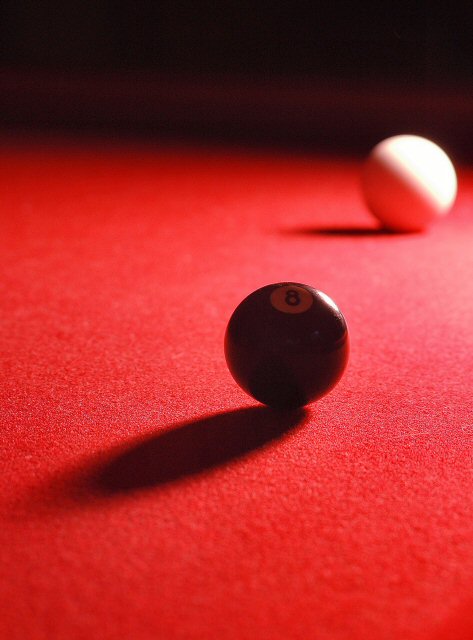
| Nicely composed and lit... it's a shame that compression has shown up in the area around the white, but on the whole I like this one. well done. |
|
 Photographer found comment helpful. Photographer found comment helpful. |
|
|
11/20/2005 08:16:25 PM |
| The 8 ball is a bit too dark for me, and understandably cause the light is coming from behind, but wouldve like to see more of it. |
|
| Photographer found comment helpful. |
|
|
11/20/2005 08:23:23 AM |
| Seems to be focused in the front of the ball. Would have been nice if it had been the 8 instead. |
|
| Photographer found comment helpful. |
|
|
11/18/2005 01:41:54 PM |
|
| Photographer found comment helpful. |
|
|
11/18/2005 11:03:27 AM |
| i dont like how out of focus the back is. |
|
| Photographer found comment helpful. |
|
|
11/17/2005 05:46:59 PM |
| Looks more like sunlight to me. |
|
|
|
11/16/2005 03:02:05 PM |
| Great use of DOF. Light/shadows work well together here. And I love the red surface. |
|
| Photographer found comment helpful. |
|
|
11/16/2005 10:20:27 AM |
| Might reposition the 8 ball to illuminate the number 8 more, as it is currently lost when it is the main feature. A little more DOF might help as the cue ball is also a major player. |
|
| Photographer found comment helpful. |
|
|
11/16/2005 09:28:58 AM |
|
| Photographer found comment helpful. |
|
|
11/16/2005 01:25:48 AM |
| nice lighting, but maybe IMO you should use higher apperture value to get a little bit sharper white ball. also nice contrast 6 |
|
| Photographer found comment helpful. |
Home -
Challenges -
Community -
League -
Photos -
Cameras -
Lenses -
Learn -
Help -
Terms of Use -
Privacy -
Top ^
DPChallenge, and website content and design, Copyright © 2001-2025 Challenging Technologies, LLC.
All digital photo copyrights belong to the photographers and may not be used without permission.
Current Server Time: 04/07/2025 01:38:58 PM EDT.