| Author | Thread |
Comments Made During the Challenge  |
|
|
11/20/2005 06:26:48 PM |
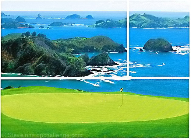
| Love the picture, but I don't think the panes do much for it. |
|
 Photographer found comment helpful. Photographer found comment helpful. |
|
|
11/20/2005 12:44:15 PM |
| The white horizontal separator looks awkward because of the foaming waves. Perhaps with a shadow or using an outlining could have been better? |
|
| Photographer found comment helpful. |
|
|
11/19/2005 04:59:41 AM |
| a hair too much sat, i think |
|
| Photographer found comment helpful. |
|
|
11/19/2005 01:31:42 AM |
| Colours look over saturated for long time viewing but are eyecatching. The pic divides naturally |
|
| Photographer found comment helpful. |
|
|
11/18/2005 04:58:55 AM |
| This is a nice shot by itself, but I feel like the division takes something away from it. Part of it is the color you decided to make the border. You lose it in the surf and the sky and that is distracting. I think it is also the way you decided to break it up. |
|
| Photographer found comment helpful. |
|
|
11/17/2005 06:05:23 PM |
| green is too saturated for my taste |
|
| Photographer found comment helpful. |
|
|
11/17/2005 05:19:52 AM |
| good shots, seems a bit oversaturated |
|
| Photographer found comment helpful. |
|
|
11/16/2005 10:14:46 PM |
|
| Photographer found comment helpful. |
|
|
11/16/2005 06:24:20 PM |
| Now, I'd like to play there. Great shot. 7 |
|
| Photographer found comment helpful. |
|
|
11/16/2005 08:49:44 AM |
| The colours seem to be artificial ... too blue ... too green ... too yellow. I don't think that the white was the best colour for the frames ... It gets lost in the sky. |
|
| Photographer found comment helpful. |
|
|
11/16/2005 08:34:29 AM |
| I love the strong colour contrasts in this picture, and although it is a breathtaking view I feel it does not benefit from being divided. |
|
| Photographer found comment helpful. |
|
|
11/15/2005 03:03:47 PM |
| Is this Waitangi golf course? Sure looks like Bay of Islands, NZ to me. |
|
| Photographer found comment helpful. |
|
|
11/15/2005 09:47:03 AM |
| A nice shot, although a bit neon. My main issue is with the divisions. This doesn't really strike me as a triptych, but seems more like a photo with lines drawn through it and is especially difficult in the portion where there are whitecaps. Perhaps a thin black border would have helped. In addition, the top and bottom sections do not line up properly on the sides. |
|
| Photographer found comment helpful. |
|
|
11/15/2005 06:54:53 AM |
| How does the division of your picture into three frames enhance the photo? How does this "tell...a story or illustrates a concept or object" better than the original image? |
|
| Photographer found comment helpful. |
|
|
11/15/2005 03:07:58 AM |
| Very nicely compsed and set up for a triptych. |
|
| Photographer found comment helpful. |
|
|
11/14/2005 05:48:47 PM |
| Pretty scene. Looks a bit oversaturated. |
|
| Photographer found comment helpful. |
|
|
11/14/2005 04:11:03 PM |
| wow, pretty! but i dont much care for where you divided the photos up. good shot nonetheless. 8 |
|
| Photographer found comment helpful. |
|
|
11/14/2005 01:33:46 PM |
| beautiful shot but doesn't feel right chopped up. |
|
| Photographer found comment helpful. |
|
|
11/14/2005 01:28:17 PM |
| Seems a little washed out, or maybe too much yellow. I wonder if a lens filter would have enhanced it. |
|
| Photographer found comment helpful. |
|
|
11/14/2005 11:01:46 AM |
| 3 - Nice colors. Criticism; a bit 'over bright'. The arrangement and frame placement doesn't work in my opinion. The color and size also do not 'enhance'. The cropping / framing / padding is not symmetrical. |
|
| Photographer found comment helpful. |
|
|
11/14/2005 10:17:10 AM |
| This would of been better with a black border...or even a green one that matches the green green. |
|
| Photographer found comment helpful. |
|
|
11/14/2005 08:59:42 AM |
| Beautiful picture and original division of image. I'm not sure that I like the white frame, though. It interferes with the waves. Black might have worked better. |
|
| Photographer found comment helpful. |
|
|
11/14/2005 08:25:24 AM |
the lines dividing your picture into three blend in with the actual picture too much.
A nice view and well captured though. |
|
| Photographer found comment helpful. |
|
|
11/13/2005 11:50:45 PM |
| Some insane golf course!! Slightly too much saturation for me. Beautiful place |
|
| Photographer found comment helpful. |
|
|
11/13/2005 10:46:18 PM |
| Blindingly oversaturated, IMO. Beautiful place though! |
|
| Photographer found comment helpful. |
|
|
11/13/2005 07:16:41 PM |
| Kauri Cliffs! I shot my first pig near here when it was a farm called the Tipene Tablelands. Nice shot! |
|
| Photographer found comment helpful. |
Home -
Challenges -
Community -
League -
Photos -
Cameras -
Lenses -
Learn -
Help -
Terms of Use -
Privacy -
Top ^
DPChallenge, and website content and design, Copyright © 2001-2025 Challenging Technologies, LLC.
All digital photo copyrights belong to the photographers and may not be used without permission.
Current Server Time: 04/07/2025 09:11:53 PM EDT.