Greetings from the Critique Club
by strangeghost
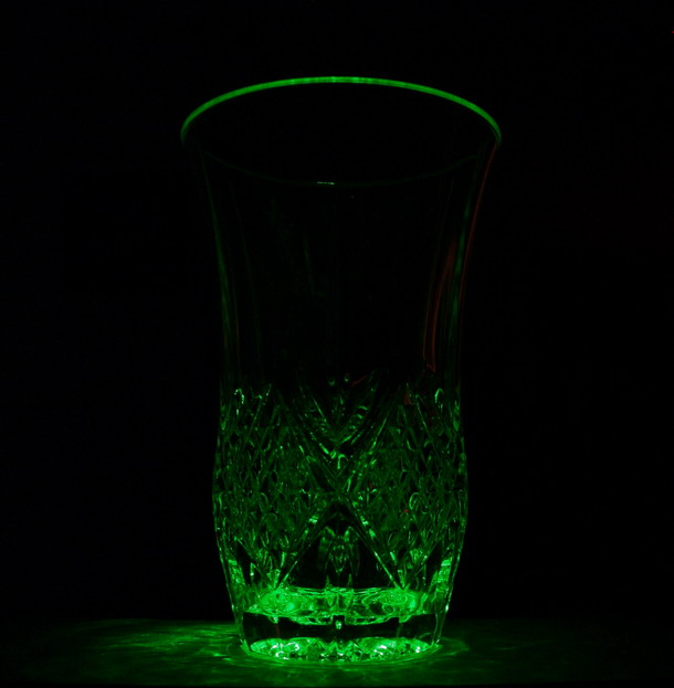
COMPOSITION
I like the monochromatic approach, and the liberal use of negative space. The way the rim of the glass seems to float in the void above the pattern is interesting. I wish you had pulled in a little tighter on the glass patterning though. That is an area of visual interest but it seems a little indistinct. Though I like the square crop, I might have recommended chopping a little more of the space from above the rim and to the sides (notwithstanding my comment about negative space above)
TECHNIQUE
An ambitious attempt here. Black background, unusual lighting and light source, and a stark minimalist approach combine to make a shot stand or fall on visual appeal and technical merit. Your bold use of black space leaves very little detail upon which to hang things like focus, sharpness, etc. There's not enough detail in the glass etching to really tell if focus is good or not. I think you might have tried for a little bit more light - either supplementing the laser light with another light source, or playing the laser light around the glass during your exposure ("painting" the glass), or even backlighting with the laser. As shot, there is so little detail that the eye is left with a relative vacuum of focal points.
OVERALL IMPACT
I really want to like this image a lot more than I do, and I suspect that voters agreed with this sentiment, given your 4.79 final score. I sense a lot of unfulfilled potential in this shot. I wonder if you experimented with a macro effect, zooming in on the etched pattern? I wonder if you looked at other points of view, and as suggested above, more and different light and lighting effects?
Fairly minimalist voter comments, which tells me you likely got tons of quick 4-5 votes and moved on. DPC really demands that you capture the voters' attention and give them some initial "wow." I think your shot had the potential to do that, but fell short of the goal. Keep shooting and keep trying for interesting effects like this.
|