| Author | Thread |
Comments Made During the Challenge  |
|
|
11/19/2005 04:15:54 PM |
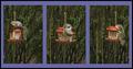
| Great work. I really like the clarity of the center compared to the others. Works really well. |
|
 Photographer found comment helpful. Photographer found comment helpful. |
|
|
11/19/2005 01:12:19 AM |
| Pity that there is nothing in focus in the two side frames - makes them pointless to me |
|
| Photographer found comment helpful. |
|
|
11/17/2005 01:02:49 PM |
| the middle one dominates the whole compostion to a too strong degree, at least IMHO. |
|
| Photographer found comment helpful. |
|
|
11/17/2005 04:58:39 AM |
| i think i would like this more if the outside frames were in focus also |
|
| Photographer found comment helpful. |
|
|
11/15/2005 06:56:35 AM |
| How does the division of your picture into three frames enhance the photo? How does this "tell...a story or illustrates a concept or object" better than the original image? |
|
| Photographer found comment helpful. |
|
|
11/14/2005 02:01:47 PM |
|
| Photographer found comment helpful. |
|
|
11/14/2005 05:58:46 AM |
| I am not a big fan on just cutting up one nice shot into 3 with distracting borders. Seems to easy, no real creativity required. However, this is a different take on that idea - i like this. A lot. This one shows some real creative thinnking IHO. |
|
| Photographer found comment helpful. |
|
|
11/13/2005 07:39:31 PM |
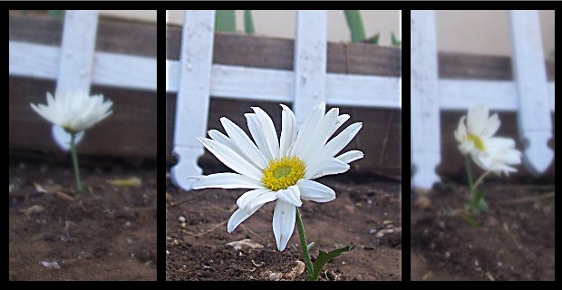
| I like the idea. The whites in the fence and the daisy tend to swallow each other up, and I would personally have preferred a more natural shift in focus from the middle panels to the sides. 6. |
|
| Photographer found comment helpful. |
Home -
Challenges -
Community -
League -
Photos -
Cameras -
Lenses -
Learn -
Help -
Terms of Use -
Privacy -
Top ^
DPChallenge, and website content and design, Copyright © 2001-2025 Challenging Technologies, LLC.
All digital photo copyrights belong to the photographers and may not be used without permission.
Current Server Time: 04/08/2025 06:31:58 AM EDT.