| Author | Thread |
|
|
12/08/2005 11:45:51 AM |
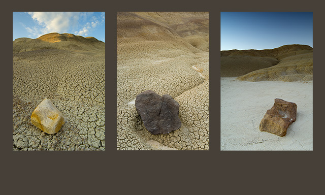
| Didn't get a chance to comment during the challenge, but wanted to say that I gave you a 6. I felt the third image was out of place there. the light color of the ground made the tryp feel unbalanced to me. Putting it in the center would have evened the whole thing up for me. |
|
 Photographer found comment helpful. Photographer found comment helpful. |
Comments Made During the Challenge  |
|
|
11/20/2005 07:04:03 PM |
| very cool series here. I really think this challenge should have allowed the use of text, because that's so obviously what belongs in the space beneath the images. I think text could have helped a lot of compositions in this challenge, especially this one. As it is, the dead space below the pics is awkward, but it seems so clear to me that a title and photo credits belong there that I don't mind the emptiness. Good luck |
|
| Photographer found comment helpful. |
|
|
11/20/2005 11:25:13 AM |
| I like the contrasting images---good composition here. |
|
| Photographer found comment helpful. |
|
|
11/19/2005 11:14:06 AM |
| Nice light and textures...I really like the neutral color pallette, esp. the warm grey background...very nice. |
|
| Photographer found comment helpful. |
|
|
11/17/2005 04:47:34 PM |
I can't be so bad if you can find such beaty there ;)
nice picks and good photos.
best of luck |
|
| Photographer found comment helpful. |
|
|
11/17/2005 10:35:33 AM |
|
| Photographer found comment helpful. |
|
|
11/17/2005 05:06:51 AM |
| Perhaps it would be a bit better with some sky in the middle picture. |
|
| Photographer found comment helpful. |
|
|
11/17/2005 12:24:44 AM |
| Nice concept. Varying the relative positioning of the rocks within the three panels may be helpful in adding even more visual interest. |
|
| Photographer found comment helpful. |
|
|
11/16/2005 06:37:59 PM |
| great effort - although the lack of sky in the 2nd image i think really breaks up the overall effect |
|
| Photographer found comment helpful. |
|
|
11/15/2005 11:08:52 PM |
| I like that each image is different, yet they are all very similar with the different rock at the front of each one. They work well together and tell a nice story. I like your color choice for the border and that the bottom part is thicker. |
|
| Photographer found comment helpful. |
|
|
11/15/2005 11:07:36 PM |
| The photo on the right works well with either of the other two, but those two are too similar, especially being next to each other. Also wish they were all a little bigger, at the expense of some of the frame at the bottom. But still well above average - 7 |
|
| Photographer found comment helpful. |
|
|
11/15/2005 10:47:55 PM |
| This is really fun. I love the background color you've chosen, it really accents the photos. |
|
| Photographer found comment helpful. |
|
|
11/15/2005 01:52:12 PM |
| Great contrasts. I think the center panel would have echoed stronger if you had included sky there as well. I like the textures and colors. 7 |
|
| Photographer found comment helpful. |
|
|
11/15/2005 09:44:12 AM |
| If only the frame weren't so bottom heavy. |
|
| Photographer found comment helpful. |
|
|
11/15/2005 03:49:00 AM |
| I wonder if it would improve if you removed the sky on the two outside pictures. |
|
| Photographer found comment helpful. |
|
|
11/14/2005 06:33:25 PM |
| I'm a fan of deserts and I think this badlands idea is great. Each are beautiful images. I am glad you ordered them the way you did. I'm not sure that the background color of gray is my favorite. It might make the photos pop out more if you used a more contrasty color, maybe white? Each of these photos looks beautiful in their own right. There is something a little funny about the placement of the rocks, maybe just that they are exactly on a line with each other. Overall I love this image. 10. |
|
| Photographer found comment helpful. |
|
|
11/14/2005 06:21:09 PM |
| Composed well. I think a black border might have provided more contrast, and made the photos pop a little. |
|
| Photographer found comment helpful. |
|
|
11/14/2005 11:47:34 AM |
| Great shots, shame those rocks are in each picture ;-) 9 |
|
| Photographer found comment helpful. |
|
|
11/14/2005 06:21:48 AM |
| Great composition. The best one I have seen... so far. Excellent lay-out. Pure magic! 10. |
|
| Photographer found comment helpful. |
|
|
11/14/2005 03:53:32 AM |
| Wonderful. A word I don't use much. |
|
| Photographer found comment helpful. |
|
|
11/14/2005 01:45:29 AM |
| I like the repetition in the very different frames. Good detail, and the light in the first frame is beautiful. |
|
| Photographer found comment helpful. |
|
|
11/14/2005 01:01:49 AM |
| Cool concept, great textures, good execution! |
|
| Photographer found comment helpful. |
Home -
Challenges -
Community -
League -
Photos -
Cameras -
Lenses -
Learn -
Help -
Terms of Use -
Privacy -
Top ^
DPChallenge, and website content and design, Copyright © 2001-2026 Challenging Technologies, LLC.
All digital photo copyrights belong to the photographers and may not be used without permission.
Current Server Time: 02/01/2026 09:29:22 AM EST.