| Author | Thread |
Comments Made During the Challenge  |
|
|
06/22/2002 08:50:00 PM |
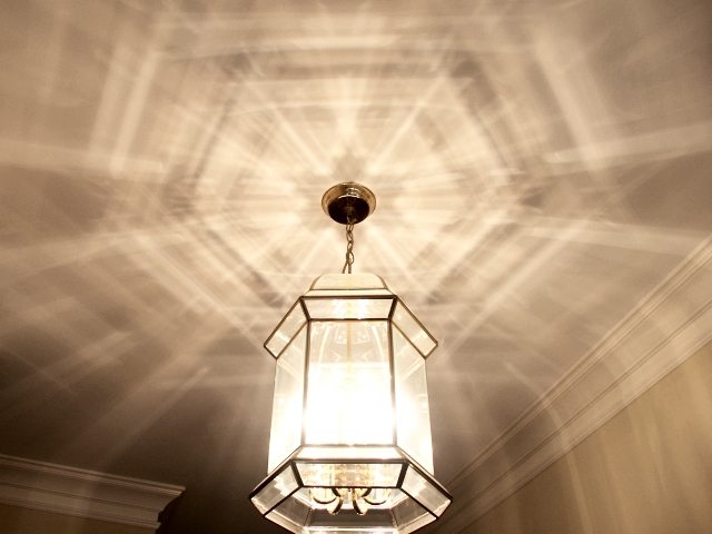
| I think cropping this, or taking the picture may have made it more interesting. Also, I tried a shot very similar to this, and I found out that if I adjusted the contrast and brightness a bit, I could get some really deep shadows around the edges, adn that may have eliminated the trim where the ceiling meets the wall. |
|
|
|
06/21/2002 04:39:00 PM |
| nicely shot, twould be nice to see a directly upwards shot. |
|
|
|
06/21/2002 11:06:00 AM |
| what a play of light. If it weren't for the baseboards in the shot it would be better. |
|
|
|
06/20/2002 11:50:00 AM |
| looks very stupid if you ask me |
|
|
|
06/19/2002 10:20:00 AM |
| This is an interesting demonstration of light reflection and refraction. I think the photo would have more impact with some slight underexposure. |
|
|
|
06/19/2002 09:54:00 AM |
| I like the shadows cast by this light fixture... i wish there would have been some way to capture this without having the walls and molding in the image... - jmsetzler |
|
|
|
06/19/2002 04:53:00 AM |
| nice! the lamp looks a bit pressed to the lower border. |
|
|
|
06/19/2002 02:10:00 AM |
| lovely photo. Good shadows. |
|
|
|
06/18/2002 10:44:00 PM |
| Very cool patterns. It's an interesting light, but I think the composition could have been stronger if you just cropped it down and showed part of the light and its patterns on the ceiling and cut out the walls. |
|
|
|
06/18/2002 03:46:00 PM |
| Unusual to have shadows that are light. I like it. |
|
|
|
06/18/2002 10:30:00 AM |
| Nice job. I was going to submit one like this with a candle carousel thing but strangely simply forgot the idea. Anyway, good composition. |
|
|
|
06/18/2002 09:54:00 AM |
|
|
|
06/18/2002 09:30:00 AM |
| Nice chandellier. Might have been better with out the light source, in my opinion. Photo 9 Creativity 7 Shadows 8 total 8 |
|
|
|
06/17/2002 06:01:00 PM |
| I have lights like this in my house and almost did the same thing. I think I would like it more if the focus of the composition were the pattern on the ceiling. |
|
|
|
06/17/2002 05:09:00 PM |
| Mmmm... Pretty patterns! I think it would have been more interesting if shot directly under the light, with the patterns spreading out around it. Still, I like. |
|
|
|
06/17/2002 01:59:00 PM |
| more of a light effect than a shadow effect. Still a great photo! |
|
|
|
06/17/2002 10:48:00 AM |
| Nice light and shadow effect - but a little tough on the eyes - maybe needed a little less exposure |
|
|
|
06/17/2002 09:29:00 AM |
|
|
|
06/17/2002 09:18:00 AM |
| You're probably getting a lot of 'Where's the shadows' remarks, but I like it. Composition 5, exposure 7, originality 6. |
|
|
|
06/17/2002 06:10:00 AM |
| The crown in the corner is distracting. |
|
|
|
06/17/2002 04:39:00 AM |
| Excellent symmetry and lines. I wish the bottom of the frame were just below the chandelier, though. |
|
|
|
06/16/2002 11:33:00 PM |
| what if the picture was taken directly under the light? |
|
|
|
06/16/2002 08:38:00 PM |
| This feels more like refraction of light, than of shadow to me. |
|
Home -
Challenges -
Community -
League -
Photos -
Cameras -
Lenses -
Learn -
Help -
Terms of Use -
Privacy -
Top ^
DPChallenge, and website content and design, Copyright © 2001-2025 Challenging Technologies, LLC.
All digital photo copyrights belong to the photographers and may not be used without permission.
Current Server Time: 04/09/2025 01:28:14 AM EDT.