| Author | Thread |
Comments Made During the Challenge  |
|
|
12/06/2005 04:56:55 PM |
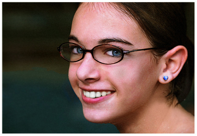
| Lovely portrait. The glasses really make it candid and fun. |
|
 Photographer found comment helpful. Photographer found comment helpful. |
|
|
12/05/2005 05:34:12 PM |
| Unusual orientation for a portrait, but it works here. I get the impression she is an unusual person, someone who would be fun to know. |
|
| Photographer found comment helpful. |
|
|
12/05/2005 04:52:02 PM |
| A pretty girl and a well done picture. She has beautiful eyes. For some reason, it is the style now to chop off the top of someone's head in a portrait - to me it looks incomplete. |
|
| Photographer found comment helpful. |
|
|
12/04/2005 08:43:59 PM |
| Personal preference...would like to see a little more above the forehead |
|
| Photographer found comment helpful. |
|
|
12/04/2005 05:50:09 PM |
| Beautiful eyes. The blue of the stud mimics her eye color. Cute trendy glasses. Something about the skin looks a bit off. Maybe Neat Image? I can't put my finger on it. |
|
| Photographer found comment helpful. |
|
|
12/03/2005 12:36:23 PM |
| I like this. Looks natural. |
|
| Photographer found comment helpful. |
|
|
12/03/2005 09:13:26 AM |
| There is a funny brownish darkening in the center of her left cheek ... as if it has been dodged while the surrounding cheek was not. If anything, the way light falls on a curved surface, that part of her cheek ought to be brighter than the rest. |
|
| Photographer found comment helpful. |
|
|
12/02/2005 01:50:52 PM |
| Very, very nice. I am not sure wether it is the blues or the smile that gets you. In reality, it doesn make a difference!!! BOL 7 Why so much empty space though? |
|
| Photographer found comment helpful. |
|
|
12/01/2005 07:31:58 AM |
| Reds seem a bit harsh..almost like saturation was pushed a bit? Nice capture though. |
|
| Photographer found comment helpful. |
|
|
11/30/2005 07:39:45 PM |
| That's a good portrait, but it seems a bit grainy to me. |
|
| Photographer found comment helpful. |
|
|
11/30/2005 07:03:55 PM |
| I would have liked to see this "softer". But...I'm sure others will say "sharper" |
|
| Photographer found comment helpful. |
Home -
Challenges -
Community -
League -
Photos -
Cameras -
Lenses -
Learn -
Help -
Terms of Use -
Privacy -
Top ^
DPChallenge, and website content and design, Copyright © 2001-2025 Challenging Technologies, LLC.
All digital photo copyrights belong to the photographers and may not be used without permission.
Current Server Time: 04/09/2025 03:09:09 PM EDT.