| Author | Thread |
Comments Made During the Challenge  |
|
|
11/22/2005 02:39:37 AM |
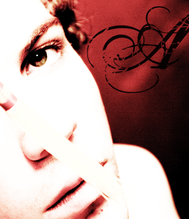
| In my opinion, that thing (Can't see what it is) in front of the nose is ruining this picture that I would find good otherwise. |
|
|
|
11/21/2005 10:58:57 PM |
| I don't know what the white thing in front of the nose is, but it is very distracting, to the point of destroying a very good photograph. |
|
|
|
11/21/2005 03:22:54 PM |
| The more I look at this photo, the more I like it. Well done. My personal pick for top ribbon contender. :) Good luck. |
|
|
|
11/19/2005 05:21:18 PM |
| looks like an album cover |
|
|
|
11/18/2005 08:12:28 PM |
| I don't like the fact that it is so over exposed. |
|
|
|
11/18/2005 01:51:49 PM |
| Interesting composition here, but the over exposed look doesn't appeal to me. |
|
|
|
11/18/2005 12:18:14 PM |
| way over contrasted and way too post edited.. |
|
|
|
11/18/2005 11:04:39 AM |
|
|
|
11/17/2005 11:46:58 PM |
|
|
|
11/17/2005 10:35:52 PM |
| What is the white tray of the face.... ? Its disturbing this otherwise well done shot. |
|
|
|
11/17/2005 07:58:52 PM |
| when you incorperate rules of thirds to this photo, you really made the eye "pop" my eyes are drawn to the eye. good job. 10 |
|
|
|
11/17/2005 01:53:06 AM |
| I like the picture, but what's in front of the face? |
|
|
|
11/16/2005 12:51:11 PM |
| Nice toning here. Unfortunately, the main subject is so overexposed there is significant loss of facial detail and I cant tell what is in front of her face - at first I thought she had something sticking up her nose! In addition, the focus seems to be off. This was a good idea, but isn't as technically strong as it could be. |
|
|
|
11/16/2005 07:11:59 AM |
| Nicely done. I like the contrast and red tones. Would have done without the stick/pen? through the face. |
|
|
|
11/16/2005 04:54:15 AM |
| Maybe I am missing something but this would have been great without the "thing" across the face, I just cant make it out so am not sure what its purpose is. |
|
|
|
11/16/2005 04:14:35 AM |
| I like the overexposed feel of this. Interesting angle. The script A is nice too!!! Great focuson the eye. |
|
|
|
11/16/2005 01:55:57 AM |
| I really like this photo, especially the composition and the colour contrast......but what is that across the centre of the subjects face???? |
|
Home -
Challenges -
Community -
League -
Photos -
Cameras -
Lenses -
Learn -
Help -
Terms of Use -
Privacy -
Top ^
DPChallenge, and website content and design, Copyright © 2001-2025 Challenging Technologies, LLC.
All digital photo copyrights belong to the photographers and may not be used without permission.
Current Server Time: 04/07/2025 01:25:43 PM EDT.