| Author | Thread |
Comments Made During the Challenge  |
|
|
11/15/2005 04:28:18 PM |
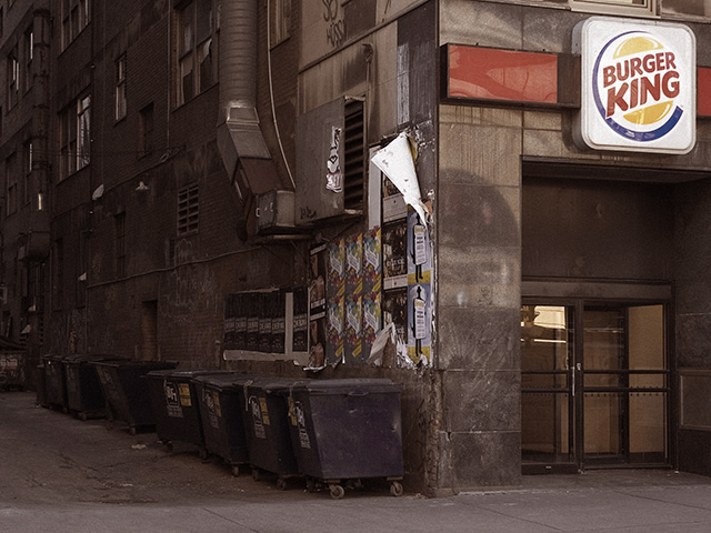
| This is one of the better shots in this challenge--the street scene-the garbage theme yet without clutter! I'm juuust slightly drawn to how the burger king logo is tilting about 2 degrees clockwise, but not enough to deter my enjoyment. |
|
 Photographer found comment helpful. Photographer found comment helpful. |
|
|
11/15/2005 06:18:19 AM |
| A little more saturation might add to the color contrast between the sign and the garbage cans. |
|
| Photographer found comment helpful. |
|
|
11/14/2005 10:52:00 PM |
| Day light makes this a bit uninteresting. Evening and slow shutter speed... and I think it would been one of the best. |
|
| Photographer found comment helpful. |
|
|
11/13/2005 04:51:25 PM |
| i like the idea, and I like the title, but something doesn't sit right... |
|
| Photographer found comment helpful. |
|
|
11/12/2005 07:49:47 AM |
|
| Photographer found comment helpful. |
|
|
11/11/2005 11:07:10 AM |
| I like the juxtaposition of the bright sign and the almost industrial-looking side of the building. |
|
| Photographer found comment helpful. |
|
|
11/10/2005 01:46:54 PM |
classic! the tones and reflections in this image make me wonder how this would look as a black & white...
nice capture and nice message. |
|
| Photographer found comment helpful. |
|
|
11/10/2005 06:41:59 AM |
| I actually really like this photo and would have scored it higher, but I would like to see a photo from the corner of the building to the end of this alley. When I cover with one hand anything that shows any part of the BK sign, I see the row of garbage containers against a very interesting wall. Would like to see what's at the end of that alley. I do understand what you're trying to convey in this photo however, and I appreciate the concept. Good luck! :) |
|
| Photographer found comment helpful. |
|
|
11/09/2005 10:02:16 PM |
| cleverly titled, well-composed... |
|
| Photographer found comment helpful. |
|
|
11/09/2005 05:44:19 PM |
| What a statement, great capture. |
|
| Photographer found comment helpful. |
|
|
11/09/2005 03:56:41 PM |
| It took me a minute to understand the title as I missed the burger king sign at first. You think it would be obvious but in my opinion the crop just didn't let you focus on it enough to give the impact I think you wanted. Maybe it could have been larger or brighter in that area. |
|
| Photographer found comment helpful. |
|
|
11/09/2005 02:04:18 PM |
| See, now I love this..it tells me a story, it is a technically good shot, and makes a statement, to boot...I am not a fan of the super studio shots that usually win here!! This , this is a good photo to me. Not a contived bunch of nonsense to fit a challenge Good Luck!!! |
|
| Photographer found comment helpful. |
|
|
11/09/2005 08:12:04 AM |
| Yeah, yeah. Cheap shot. I like Whoppers! But I can't dismiss the photo which has lots of "trashy" detail like the posters and grafitti as well as the trash bins. |
|
| Photographer found comment helpful. |
|
|
11/09/2005 06:37:14 AM |
| Nice idea. The title assists in telling the story. I like it. |
|
| Photographer found comment helpful. |
Home -
Challenges -
Community -
League -
Photos -
Cameras -
Lenses -
Learn -
Help -
Terms of Use -
Privacy -
Top ^
DPChallenge, and website content and design, Copyright © 2001-2025 Challenging Technologies, LLC.
All digital photo copyrights belong to the photographers and may not be used without permission.
Current Server Time: 04/07/2025 04:35:34 AM EDT.