| Author | Thread |
|
|
11/20/2005 08:02:58 PM |
| I really loved this (9) and feel it was totally under-rated with this placement! |
|
 Photographer found comment helpful. Photographer found comment helpful. |
Comments Made During the Challenge  |
|
|
11/20/2005 05:41:05 PM |
| Very Nice, Love the subtle emotion conveyed across the panes. Great use of color! |
|
| Photographer found comment helpful. |
|
|
11/20/2005 02:05:41 PM |
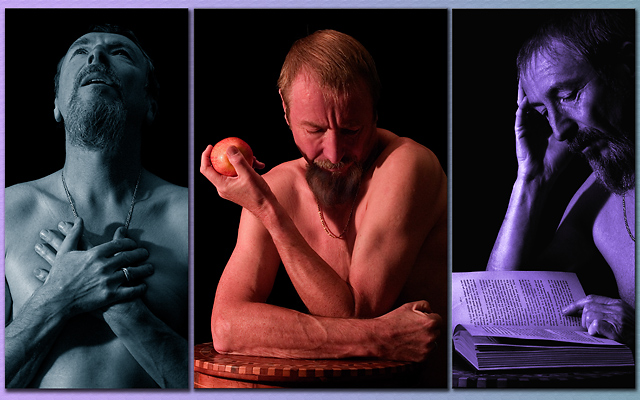
| the inimitable rhipster. I love the cyan of the left image especially. for the "physical" image, I wonder if a somewhat harder light might have worked better, to accentuate the musculature. |
|
| Photographer found comment helpful. |
|
|
11/20/2005 06:54:20 AM |
|
| Photographer found comment helpful. |
|
|
11/17/2005 08:42:58 PM |
| My favorite in this challenge, 10 |
|
| Photographer found comment helpful. |
|
|
11/17/2005 04:56:25 AM |
|
| Photographer found comment helpful. |
|
|
11/16/2005 03:22:37 PM |
| very well done. I lik this |
|
| Photographer found comment helpful. |
|
|
11/15/2005 05:53:40 PM |
| Excellent concept. I like the shots and especially the coloring on the first one. I also like the differing colors but something feels not *quite* right about the other two. Maybe the purple is a little too intense? I'm not sure. Otherwise, nicely done. |
|
| Photographer found comment helpful. |
|
|
11/15/2005 02:00:29 PM |
| Good work, the different hues come over well. I like what you have put into this, however the border is not justifying the image for me. Still a top photo though. |
|
| Photographer found comment helpful. |
|
|
11/15/2005 09:42:55 AM |
|
| Photographer found comment helpful. |
|
|
11/14/2005 02:03:07 PM |
| Nice..not sure I like the colors..but its still a good photo!! 8 |
|
| Photographer found comment helpful. |
|
|
11/14/2005 09:24:16 AM |
| Fabulous job here Rene :) I do like the color selection of this image. The only improvement I can see is to make the frame itself black instead of the purple color you have as it competes with the far right coloration. The title fits perefctly as well. |
|
| Photographer found comment helpful. |
|
|
11/14/2005 07:26:47 AM |
| I like how you have used the triptych form to make a point. The concept is good, lighting works well and the poses are classical. The only thing that I think might improove is the color saturation, A little less or perhaps pure B/W. |
|
| Photographer found comment helpful. |
|
|
11/14/2005 06:25:56 AM |
| This is one of those entries that I can't decide on. If I were to see each individual image on its own, I'd go nuts. But when you put them together and with the color variation, I become confused. The center shot is my fav. The purple cast one is also good with the light bouncing off of the right arm. I think I'd say up the contrast on the blue one a smidge. I didn't vote it "down" per se, but gave it a 7. Upon 2nd review and comments, I'm sticking to it for the reasons given above. I hope this makes sense. Still well done. |
|
| Photographer found comment helpful. |
|
|
11/14/2005 06:21:20 AM |
Your missing the Spiritual. I would have given this a 10 had you included that.
Still an excellent Triptych. 9. |
|
| Photographer found comment helpful. |
|
|
11/13/2005 07:19:36 PM |
| I like the idea and the poses. The colors detract from it, I think, though. |
|
| Photographer found comment helpful. |
Home -
Challenges -
Community -
League -
Photos -
Cameras -
Lenses -
Learn -
Help -
Terms of Use -
Privacy -
Top ^
DPChallenge, and website content and design, Copyright © 2001-2025 Challenging Technologies, LLC.
All digital photo copyrights belong to the photographers and may not be used without permission.
Current Server Time: 04/07/2025 02:11:42 AM EDT.