| Author | Thread |
|
|
02/14/2008 07:17:27 PM |
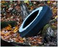
Garbage is EVERYWHERE. You even BUY it. Some of us buy INTO it. This will probably not do well at all... But for some reason all those fashion pages, scream garbage to me.
good for you! Smart enough to avoid the virus of the mind. Yay! |
|
 Photographer found comment helpful. Photographer found comment helpful. |
Comments Made During the Challenge  |
|
|
11/15/2005 03:45:36 AM |
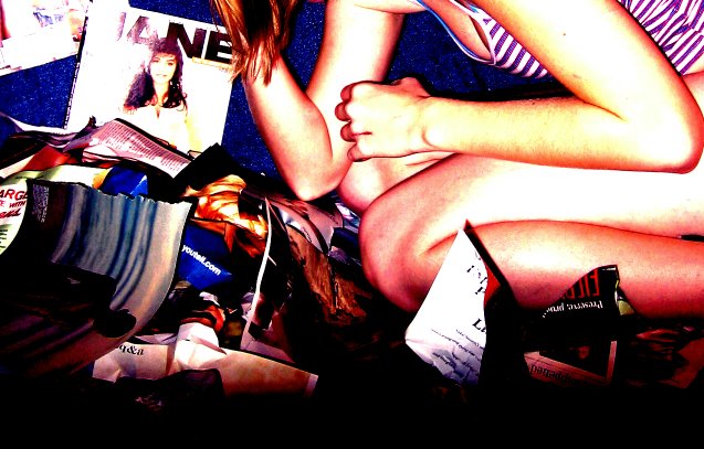
| Tough subject to take an appealing photo of but this is a great idea. Not sure I quite like the choice of lighting though, but well done still. |
|
| Photographer found comment helpful. |
|
|
11/13/2005 01:20:28 PM |
| Your photo shows creativity, but for me, I think the reds and yellows are a bit overdone, especially around her forearm and leg. |
|
| Photographer found comment helpful. |
|
|
11/13/2005 02:18:51 AM |
| Good choice on the high contrast here, would have loved to seen the model's face though, but I can appreciate that it might detract from the 'garbage' element, as well as compelling you to choose a new title. |
|
| Photographer found comment helpful. |
|
|
11/12/2005 04:53:59 PM |
|
| Photographer found comment helpful. |
|
|
11/12/2005 12:24:17 PM |
| Like the color and comp. Reminds me of some music video that I can't put my finger on. Good luck. |
|
| Photographer found comment helpful. |
|
|
11/12/2005 08:23:03 AM |
| What a unique perspective on this challenge, hope you do well this is very original. |
|
| Photographer found comment helpful. |
|
|
11/12/2005 06:05:37 AM |
|
| Photographer found comment helpful. |
|
|
11/11/2005 08:39:15 PM |
| Not fond of the over saturated/over processed look. |
|
| Photographer found comment helpful. |
|
|
11/10/2005 10:48:12 PM |
| Harsh highlights can sometimes add value to the photo, but it is not the case here. 6 |
|
| Photographer found comment helpful. |
|
|
11/10/2005 06:56:52 PM |
| i love jane magazine! you should send this image to them. wish there wasn't as much glare on the mag, but like the effect on the model. |
|
| Photographer found comment helpful. |
|
|
11/09/2005 09:50:41 PM |
| Not to my taste, sorry.Oversaturated and too much contrast. The framing leaves me wondering what the subject is -- the ripped up pages or the woman? |
|
| Photographer found comment helpful. |
|
|
11/09/2005 02:27:17 PM |
| This picture is so busy and confused it's hard to really see what is going on or what the subject of the picture actually is. It would have been very good for the busy challenge. The lighting is very harsh on the girls arms and legs and the upper left corner. |
|
| Photographer found comment helpful. |
Home -
Challenges -
Community -
League -
Photos -
Cameras -
Lenses -
Learn -
Help -
Terms of Use -
Privacy -
Top ^
DPChallenge, and website content and design, Copyright © 2001-2026 Challenging Technologies, LLC.
All digital photo copyrights belong to the photographers and may not be used without permission.
Current Server Time: 02/01/2026 08:51:11 AM EST.