| Author | Thread |
|
|
11/03/2005 06:37:05 AM |
Hello from the Critique Club!
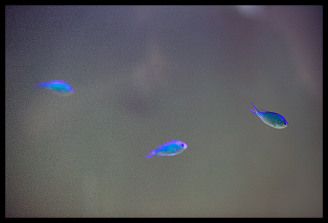
I have been studying your image and find a few elements I like and a few I don't. First, I think this image has a lot of potential. Your idea/concept (based on the image and title combination) is well presented. But I find some elements distracting.
Lighting - well done - no flares or glares to distract and it is not harsh or too dark either. It works well with the subject matter.
Color - the contrast of the colors of the fish and the general background is very good. It makes the fish instantly pop out. However, in the background (or perhaps the foregound in reality) there seems to be a reflection. This element I find distracting. It seems you can almost make out a person (you??) taking the picture, but not quite. Plus the color variations on those few spots distract a bit (between the left two fish, above the right fish in the top corner). I think a tighter crop on the top would have helped this by eliminating the white spot there as well as some of that reflection.
Composition/perspective - I like the amount of negative space in the image. This works here quite nicely. It also is a plus that you cannot readily discern the direction of movement of the fish by their angle of placement in the water. I know you cannot control this so your timing was quite good. One appears to actually be swimming up and coupled with your title really does give the impression the fish are swimming up to you as if you were above. With more or less fish in the shot I don't think this effect would be as strong.
Challenge requirements - I think the gradient application of the noise really makes your concept work. The shot really does make you think they are rising from the depths. However, I would have liked to see a bit more on the right. As it is is still good and unique though.
Overall I think this is a pleasing image and a very well done concept. You achieved the effect you were after. Nice job! |
|
Comments Made During the Challenge  |
|
|
10/30/2005 10:51:25 AM |
| very unusual. me likey. how did you get the gradient of graininess? |
|
 Photographer found comment helpful. Photographer found comment helpful. |
|
|
10/29/2005 07:49:28 AM |
| HOW cool!!!!!!! I love this. How creative! |
|
| Photographer found comment helpful. |
|
|
10/29/2005 05:16:24 AM |
| i love the minimal / depth thing going on here. 6 |
|
| Photographer found comment helpful. |
|
|
10/28/2005 07:18:52 PM |
| My favorite part of your photo is the fish on the far right. My least favorite part is the fish on the left - although it is in the grainiest part of yout photo. It's an okay photo, but for me, it doesn't hold my interest or make me say "wow" compared to other entries. |
|
| Photographer found comment helpful. |
|
|
10/27/2005 12:36:18 AM |
| i lik ethe idea.. and out of the box grain use, some how i am a bit more 'conservative' (OMG, who would have thought i would ever be saying that ) |
|
| Photographer found comment helpful. |
|
|
10/26/2005 09:26:06 PM |
|
| Photographer found comment helpful. |
|
|
10/26/2005 07:14:26 AM |
| Needed to focus better. The image would not have been wrecked either if you cropped more out of it. By zooming in in editing, say the center to the right of the image, it would have created more grain and been a better image. |
|
| Photographer found comment helpful. |
|
|
10/25/2005 11:01:32 AM |
| I really like this one, very simple, good color and love the way the fish is almost coming out and transforming from noise into focus. Great choice of frame to complete this shot. |
|
| Photographer found comment helpful. |
|
|
10/25/2005 06:13:23 AM |
| For me, the fish are too small to carry the photo. There is only one fish in focus, one blurry fish, and I wouldn't know what the third one was if not for the other two. The reflection is a bit distracting, and the color of the water does not appeal to me. |
|
| Photographer found comment helpful. |
|
|
10/25/2005 04:37:36 AM |
| Great use of negative space and subtle grain. Nice contrasts here in color. |
|
| Photographer found comment helpful. |
|
|
10/24/2005 04:44:43 PM |
| Not sure if it should get a 10 or a 4.....It is different than the rest...in "subject"...has grain...color on fish is cool.....Hmmmm how about ahhhh ...let's see....I'll split it.... 7 |
|
| Photographer found comment helpful. |
Home -
Challenges -
Community -
League -
Photos -
Cameras -
Lenses -
Learn -
Help -
Terms of Use -
Privacy -
Top ^
DPChallenge, and website content and design, Copyright © 2001-2025 Challenging Technologies, LLC.
All digital photo copyrights belong to the photographers and may not be used without permission.
Current Server Time: 04/09/2025 07:42:18 PM EDT.