Hello from the Critique Club!
I have studied your image and have the following to offer:
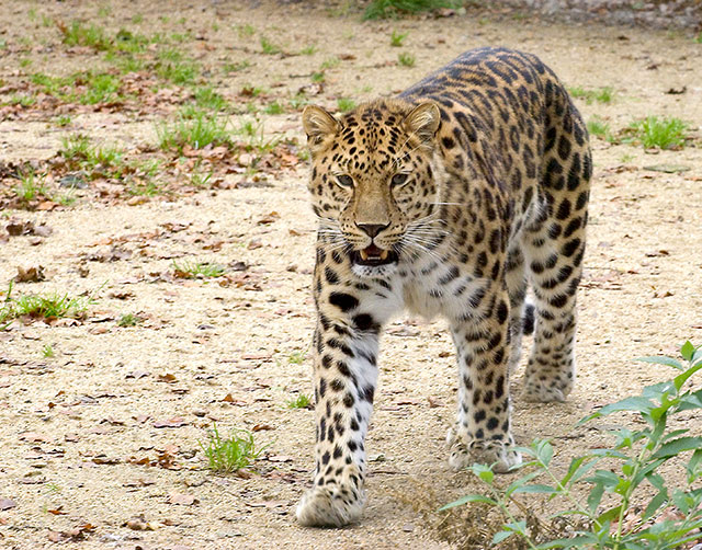
Composition/perspective - I find this photo to be well composed and free of distractions. The small bushes in the front right don't hurt it at all. The photo is clean and sharp and well focused. You did not list what lense you used so it is hard to tell distance from subject, but the perspective is really nice - low, almost eye level and not much behind it to draw you away. The subject to space ration is very well done. The relatively empty setting gives it an open feel and allows you to focus on your subject. The leopard is looking right at you which also helps the image. Well done!
Color - the palette here is rich and full although only in a short range. The bits of green stand out against the browns and tans while not over doing it. The colors in the cat are well separated and the overall tonal quality allows it to stand out against the tans of the soil. I think you added just the right amount of contrast. Any more and in my opinion, the cat would have appeared 'painted' or 'stuffed.' As is it looks entirely natural.
Lighting - obviously natural light. Your control over your placement and relationship to the cat is very well done - no hard shadows to contend with. This may have to do with the weather. But even absent direct sunlight you would expect more shadow from the cat without good control. Again, this helps the cat stand out. The lack of a busy backgbround also helps here. You stated this was in a zoo, distracting backgrounds are always present and in zoos usually offer only dark shadows.
Challenge requirements - this may be where this image fell short. I do not immediately get delicate from this image. The teeth showing make it appear more menacing or threatening than delicate. Yes, their plight in the real world may be hinged upon a delicate balance between man and nature, unfortunately this doesn't come through in this image. Especially when most viewers/voters are not going to take the time to study the image and only go for the immediate impression.
Overall/my opinion - very well composed and processed image. The cat is a very strong element and application of the rule of thirds is very well done here. Technically it is hard to beat this image. As stated above, I think it fell short in the delicate aspect. Maybe a different pose of the cat - sitting/laying, no teeth showing...many possibilities. They may not have exactly shown delicate either, but it may have been 'softer.' |