| Author | Thread |
|
|
11/05/2005 07:14:15 PM |
Hello from the Critique Club!
I have studied your image and have the following to offer:
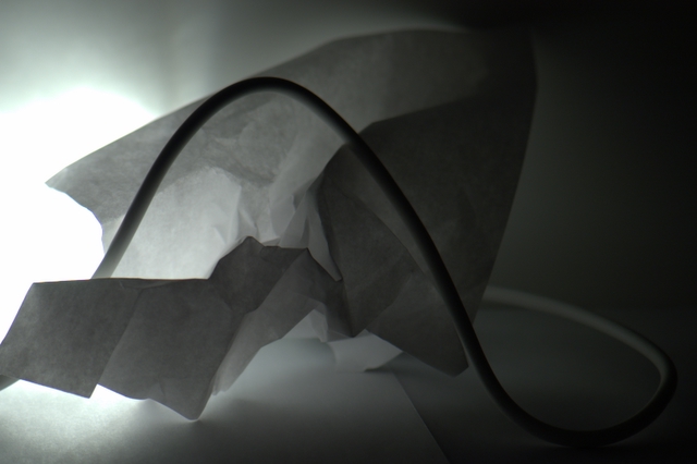
Composition/perspective - this is an interesting composition and clearly shows a creative process was behind its creation. Some of the frame is in focus but the right side and top of the image are not. This is a little bit of a distraction. The focus seems to be only on the light source. Your angel to the subject is good which allows it to be off the wall and floor at the same time - not flat.
Lighting - I think this is the weakest aspect of this image. It seems you have a grasp of the concept of white on light, but did not use the lighting necessary to create the same photograph as you saw in your minds eye. A brighter and more direct light on the background to fill the background would have helped as well as light directly at your subject to brighten that as well. As it is here, the image is very dark despite both the subject and wall being white due to the single light source embedded in your subject.
Color - in a challenge such as this I would not expect to see an abundance of color in an image, but I would expect to see a lot of white and lighter shaded areas. This image is very dark due to shadows which takes away from any light element you may have had.
Challenge requirements - if this was lit differently this could have been a strong image for the challenge. As it is here, it really kind of fails to meet the challenge. More of the image is dark - grays and even black - than is light or white.
Overall/my opinion - if you had better lighting and took a little more time in thinking about the set-up and afterwards really thinking about your image, you could have done much better. This image shows a very creative side which just did not translate well into the challenge. Please do not be discouraged by this critique. You certainly have potential and the eye for the unique shot/perspective. I look forward to seeing your future work. |
|
Comments Made During the Challenge  |
|
|
10/31/2005 08:06:59 PM |
| Interesting composition with very simple objects, but it is awfully dark for a light on white entry. |
|
|
|
10/28/2005 01:49:18 PM |
| Very abstract and modern looking... would be good inspiration for architects, I think... :) 8 |
|
|
|
10/27/2005 04:20:40 PM |
| Nice compostiton, but too dark. I know the challenge topic, and know you met it, but for me the image just doesn't get the message across as well as other examples. I won't accept the term narrow mindedness, but I will admit to a certain mind set in my opinion. |
|
|
|
10/27/2005 01:44:28 PM |
| The picture looks really dark on my screen |
|
|
|
10/26/2005 03:19:37 PM |
| I like the paper and the wire, but I find the light distracting and for this challenge the background should have been white. |
|
|
|
10/26/2005 02:30:39 AM |
I think there is a great light in this picture,
which makes the composition
very interesting to look at.
Perhaps the background could be a bit more white,
but the picture good. |
|
 Photographer found comment helpful. Photographer found comment helpful. |
|
|
10/26/2005 01:01:54 AM |
| I think if the angle of your light was different. I would be more impacting... |
|
| Photographer found comment helpful. |
Home -
Challenges -
Community -
League -
Photos -
Cameras -
Lenses -
Learn -
Help -
Terms of Use -
Privacy -
Top ^
DPChallenge, and website content and design, Copyright © 2001-2026 Challenging Technologies, LLC.
All digital photo copyrights belong to the photographers and may not be used without permission.
Current Server Time: 02/01/2026 12:07:51 PM EST.