| Author | Thread |
|
|
11/03/2005 05:23:02 PM |
Hello from the Critique Club!
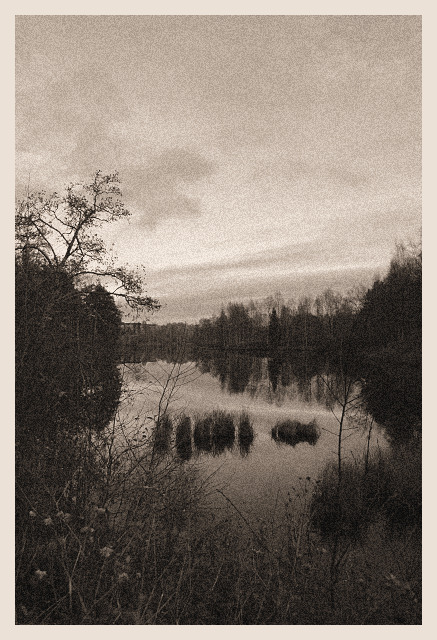
Ok..have been studying this image for a while now...I have some likes and dislikes, but overall it is a nice capture.
Composition/perspective - your location is nice. It appears you are just above the water level which works well for the composition. The pond almost acts as a leading line drawing you into the shot. Not being a straight on shot down the pond also works quite well. I find the thin branches on the left foreground to be a bit if a distraction (the ones that appear over the water by the grassy islands, not the tree above them). The bottom of the picture is a bit busy and perhaps with a tighter crop on the bottom would eliminate this. With the negative space on the top I feel the image would still be strong.
Color - the black and white is nice, but some areas appear a bit dark. There is more detail in some of the reflections than there is in the trees themselves. The tighter crop on the bottom would also remove some of the darkness found there.
Challenge requirements - the grain in this image helps it out as opposed to hurting it. However, with the dark areas some of the grain effect is lost. The application is uniform though which helps it out a lot.
The border - to be honest I am not a big fan of borders on a lot of images. This border is just a bit too wide for the image. It pushes the perspective back just a bit adding a sense of distance that is not really there. (look at the color version and this one alternately and you will see what I mean)
Overall/my opinion - This is a strong image but I do feel it could be lighter in some areas and I just get distracted by those thin branches in this version. I like the negative space on the top which I think would support a tighter crop on the bottom. Well done! |
|
 Photographer found comment helpful. Photographer found comment helpful. |
Comments Made During the Challenge  |
|
|
10/28/2005 05:04:59 AM |
| This has an Escher-isc effect even with the muted tones. Nice image! |
|
| Photographer found comment helpful. |
|
|
10/27/2005 03:08:33 PM |
| grain really suits the pic and mood |
|
| Photographer found comment helpful. |
|
|
10/26/2005 06:15:11 PM |
Nice classic photo, looks like something you would find in a book.
|
|
| Photographer found comment helpful. |
|
|
10/25/2005 10:17:06 PM |
| Well done! The grain really adds to the image and I like the composition. IMHO, maybe just a tad too much sky above... |
|
| Photographer found comment helpful. |
|
|
10/25/2005 07:31:46 PM |
| Just put this on a card and send it to me. Awesome quietness evoked by perfect use of grain. (10) |
|
| Photographer found comment helpful. |
|
|
10/25/2005 08:00:53 AM |
| Very good use of image grain! Good luck! |
|
| Photographer found comment helpful. |
|
|
10/25/2005 04:16:05 AM |
| I have a feeling this may not be well received. Its a shame. This image is made by its mood - something serene and yet, at the same time, sad. I have similar images but you have taken it one step further. Kudos - 9 - good luck in the challenge! |
|
| Photographer found comment helpful. |
|
|
10/24/2005 04:46:37 PM |
|
| Photographer found comment helpful. |
|
|
10/24/2005 10:08:24 AM |
| Is this you bear? I like this one a lot. It's at a 6 for the moment, but I'm sure I'll bump it up the second time through. Good amount of grain (I can see it!). Nice subject and mood. The grain enhances on this one. |
|
| Photographer found comment helpful. |
|
|
10/23/2005 10:57:36 PM |
| I think the use of grain here has left the image a little flat without any real contrast. It probably has created a mute feeling to the image. |
|
| Photographer found comment helpful. |
Home -
Challenges -
Community -
League -
Photos -
Cameras -
Lenses -
Learn -
Help -
Terms of Use -
Privacy -
Top ^
DPChallenge, and website content and design, Copyright © 2001-2025 Challenging Technologies, LLC.
All digital photo copyrights belong to the photographers and may not be used without permission.
Current Server Time: 04/07/2025 01:18:47 PM EDT.