from one of the less-frequented by-ways of the Critique Club ...
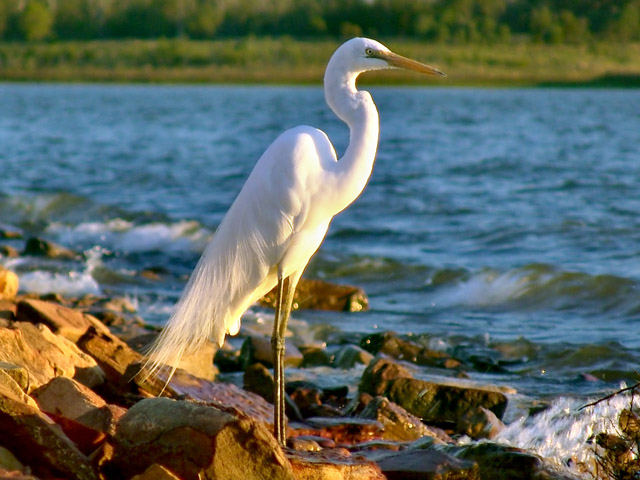
Given the finesse and rather strong approach to composition of your portrait work, I'm rather surprised to find that this is yours. Certainly you have a noticeable preference for a centred subject, but also you have a propensity to allow your subjects far more breathing space than this. It has the distinct feeling of an uncropped photograph - the aspect ratio, the tangle of twigs in the bottom right corner - though of course without your notes it's impossible to be certain.
I don't find a hell of a lot to critique about it, in many ways. There are areas where I might suggest a different approach: I think I'd have reduced the exposure a little, to prevent that blowing-out of highlights along the breasline; my instinct would certainly be to frame differently - almost definitely a portrait, rather than landscape; I might also have considered, for this challenge, including rather more landscape - using that to place the bird in relation to its world, as opposed to what becomes a simple depiction of the thing as presented here. Bt those are simply personal prefernes and thoughts, and really refer to an imaginary other photograph than this.
I can understand your using it for this challenge - but I think for many, myself included, this will have stretched the boundaries of the meaning of delicate too far. Whilst they certainly always seem liable to be easily broken - those legs! - and whilst the formation of the feathers on the wings is certainly minutely precise (and pretty well suggested here), one look at that beak and those eyes (and forget not that the eyes are the first and most natural point of a viewer's interest in all portraits) and any suggestion of delicacy flies out the window. He seems a hunter, pure and simple; little more than a mobile spear. That, I think (and I'd say the results bear me out) will certainly have lost you a few votes.
But I think it's the composition that really puts it into 'around average' territory. This is my reaction on first seeing the shot: the eye of course is drawn immediately to the head and eyes of the bird - this is human-default mode, and unavoidable; The brightness of the body then pulls the eye down, until the sense of action in bottom-right of frame pulls the eye there - however, given the depth of field, the confision of those twigs, htere isn't much to hold interest there - and the next strongest shape in your image, the slight curve of the shoreline, draws the eye up and left, hunting for some resolution amonst those boulders and splashes, and not really finding anything. Lines other than the vertical and horizontal draw the interest more quickly than others - however suggested rather than precise they are, and I think in photographs of the natural world sometimes your only key to a graphical sense of composition can be in suggested and hinted-at lines. And having mentioned horizontal lines - well, what's that, immediately below your subjects head, almost literally marginalising what ought to be the very centre of attention?
I think more than anything those factors combine to give a sense of the uncomfortable to this image, without there being anything blatantly 'wrong' with it. And yet you seem to have a natural way with such lines in your portraiture ... very strange.
Good luck in future; I must find time to see more of your work.
Ed |