| Author | Thread |
|
|
11/07/2005 06:32:28 PM |
***Greetings from the Critique Club***
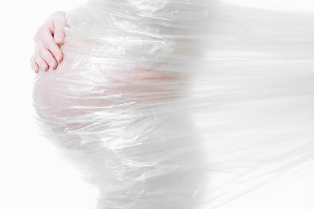
Does this meet the Challenge: Yes, I think this is a great photo. The light on white is great in this photo! The plastic wrap is very different but very cool!
The only thing I can see wrong with the photo is the top of the hand is a little blown out. And I mean a little! The color of the hand is right on! I think light on white was a hard challenge..Congrats on your 33 place!
I hope my comments helped!
Phillip |
|
 Photographer found comment helpful. Photographer found comment helpful. |
Comments Made During the Challenge  |
|
|
11/01/2005 10:45:01 PM |
| I like this photo; I was looking at it several times and first i didn't exactly know what does it tell me; still, i had to come back and look at it; the baby's new life and mother's life is re-newing as well? well, i gonna add this to my favorites - maybe there is more details in your description. |
|
| Photographer found comment helpful. |
|
|
11/01/2005 09:26:33 PM |
|
| Photographer found comment helpful. |
|
|
10/31/2005 09:55:16 PM |
| I feel this image would have been stronger without the plastic, but I still like it. |
|
| Photographer found comment helpful. |
|
|
10/31/2005 08:47:31 PM |
| original thinking shown...love it! |
|
| Photographer found comment helpful. |
|
|
10/31/2005 05:14:52 PM |
|
| Photographer found comment helpful. |
|
|
10/29/2005 01:24:07 AM |
| Very interesting prespective. |
|
| Photographer found comment helpful. |
|
|
10/29/2005 01:04:45 AM |
| What an interesting and unique shot, well done. |
|
| Photographer found comment helpful. |
|
|
10/28/2005 10:11:27 PM |
|
| Photographer found comment helpful. |
|
|
10/28/2005 02:29:11 PM |
| I think this is quite creative and the use of all the different shades of white is amazing. |
|
| Photographer found comment helpful. |
|
|
10/27/2005 08:37:06 PM |
| Very unique and a little memerizing... great job... :) |
|
| Photographer found comment helpful. |
|
|
10/27/2005 03:55:41 PM |
| You seem to have this concept 'wrapped up'. |
|
| Photographer found comment helpful. |
|
|
10/27/2005 07:05:35 AM |
| 7 - Whilst no expert on 'highlight control' re the Challenge, seems to me you have done very well to not 'blow' any surface. It is a 'weird concept', the plastic (or maybe I just don't 'get it'-unless it is a giant slingshot), but it does have create a certain impact here. Criticism; not much, obviously an 'artistic' type take, so it is pretty much your own thing, but 'technically', maybe a little different lighting, not sure. I mainly concentrated on the skin tone of the hand and the highlights v the white background there and seems 'well done'. |
|
| Photographer found comment helpful. |
|
|
10/26/2005 10:38:23 PM |
| Wow, Interesting use of tarp to get this effect. Nice picture. good use of space. |
|
| Photographer found comment helpful. |
|
|
10/26/2005 09:42:47 PM |
|
| Photographer found comment helpful. |
|
|
10/26/2005 02:46:27 PM |
| i like this. very creative and thought out entry. I wonder what this would have looked like with a opaque plastic.....just an idea. good luck :o) ~~Cher~~ |
|
| Photographer found comment helpful. |
|
|
10/26/2005 11:04:12 AM |
|
| Photographer found comment helpful. |
|
|
10/26/2005 10:54:48 AM |
OH COOL!!!! This would be a great advertisement billboard . VERY NICELY DONE!!! So artful.
On second review, I'm still an ultra fan of this. It's so out of the box and I love the abstract sense it it. 9 for sure without hesitation!!! |
|
| Photographer found comment helpful. |
Home -
Challenges -
Community -
League -
Photos -
Cameras -
Lenses -
Learn -
Help -
Terms of Use -
Privacy -
Top ^
DPChallenge, and website content and design, Copyright © 2001-2026 Challenging Technologies, LLC.
All digital photo copyrights belong to the photographers and may not be used without permission.
Current Server Time: 02/01/2026 07:56:02 AM EST.