| Author | Thread |
|
|
11/07/2005 02:44:59 PM |
Hello from the Critique Club!
I have studied your image and have thew following to offer:
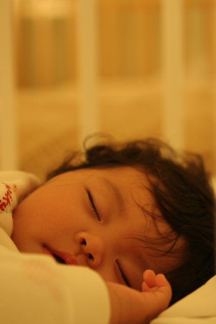
Composition/perspective - your use of negative space the having your subject fill the entire bottom half of the photo work real nice together. The synergy makes the photo real and not just another 'baby' shot. The focus is a little soft but it does not hurt the image much. The DoF is well controlled as the forground, although a but fuzzy, is not so far out that it becomes a distraction. Taking the shot at her level really works as well. A top down shot would not be as good and would appear flat in my opinion.
Color - this is where the image falls short I think. It has a distinct yellow tinge to the whole image. Perhaps a white balance adjustment in post processing or a levels/color/hue adjustment would have helped. The small splash of red is ok, the hair is ok, it is the skin tones and general background that give it a distinct yeollow tint. This may have been due to lighting in which an adjustment to the white balance in camera would have eliminated that.
Lighting - this appears to have been shot with just the ambient lighting and no flash. On camera flash may have helped this some along with white balance (see above). There are no blown out areas or really dark shadows which also leads me to believe it was simply camera settings that let this down.
Challenge requirements - the expression of being completely at ease in this shot is one of the strongest aspects. It is also his/her (?) expression that lends itself to the theme of 'delicate.' In my opinion if she was awake it would not have that same feeling. Nice capture of the mood to express the theme.
Overall/my opinion - the lighting was the biggest detractor in this image. Although the subtle lighting makes it work on some levels, the overall yellow tint to the image hurt it. It is a beautiful capture that some processing could probably make even stronger. I would not can the photo, but I would work on it in an editor for sure. Your perspective and eye for the moment are clearly demonstrated here. I am sure we will all be graced with more images of this child as it grows. |
|
 Photographer found comment helpful. Photographer found comment helpful. |
Comments Made During the Challenge  |
|
|
11/01/2005 08:07:35 AM |
|
| Photographer found comment helpful. |
|
|
10/31/2005 06:22:06 AM |
| interesting use of negative space. cute kid. why so yellow? |
|
| Photographer found comment helpful. |
|
|
10/28/2005 01:31:08 PM |
| Adorable. :) The white balance seems to be off a bit, which gives it a bit of a yellow cast. |
|
| Photographer found comment helpful. |
|
|
10/28/2005 11:15:35 AM |
| This is very cute, I would have been inclined to try to take out the yellowness/redness at least a bit, by adding blue and cyan. |
|
| Photographer found comment helpful. |
|
|
10/26/2005 06:10:50 PM |
| How precious. They are just angels at this age. Great shot and use of space. Its has a bit of a yellow hue but I think that can be adjusted with some software. Nice shot! |
|
| Photographer found comment helpful. |
|
|
10/26/2005 02:28:08 PM |
run this through a white balance/colour correction. to me, the yellow ruins it.
|
|
| Photographer found comment helpful. |
Home -
Challenges -
Community -
League -
Photos -
Cameras -
Lenses -
Learn -
Help -
Terms of Use -
Privacy -
Top ^
DPChallenge, and website content and design, Copyright © 2001-2025 Challenging Technologies, LLC.
All digital photo copyrights belong to the photographers and may not be used without permission.
Current Server Time: 04/08/2025 01:56:00 AM EDT.