| Author | Thread |
Comments Made During the Challenge  |
|
|
10/19/2005 08:02:34 PM |
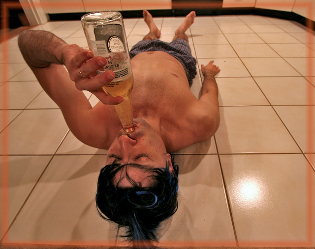
| i like the border...but not a good idea for this topic |
|
|
|
10/19/2005 01:59:11 PM |
| Great idea, nice angle and composition.... But that frame?.... |
|
 Photographer found comment helpful. Photographer found comment helpful. |
|
|
10/19/2005 11:10:07 AM |
| I like the humour, but having good idea we should also seek for photographic picture quality. Take a look to higher rated photos - there are lot of them to learn from... |
|
| Photographer found comment helpful. |
|
|
10/18/2005 11:35:32 AM |
| The concept had potential but the lighting is not very good. |
|
| Photographer found comment helpful. |
|
|
10/17/2005 10:51:05 AM |
Fit Challenge Criteria: 2/2
Contrast/Color: 0/2
Composition: 1/2
Photo Quality: 1/2
My Subjective Affinity: 0/2
Nice job on portraying the wide angle here. I would like to see one without the border, and perhaps with more controlled lighting. The hot spot in the lower right draws attention away, and all of the tiles just seem a little too dark. |
|
| Photographer found comment helpful. |
|
|
10/17/2005 01:06:37 AM |
| Fun. Won't as fun tomorrow though. :) |
|
| Photographer found comment helpful. |
|
|
10/16/2005 08:49:55 PM |
| ROFL. I'm impressed with how clean the floor is! LOL This is really funny and suits the challenge too. |
|
| Photographer found comment helpful. |
Home -
Challenges -
Community -
League -
Photos -
Cameras -
Lenses -
Learn -
Help -
Terms of Use -
Privacy -
Top ^
DPChallenge, and website content and design, Copyright © 2001-2025 Challenging Technologies, LLC.
All digital photo copyrights belong to the photographers and may not be used without permission.
Current Server Time: 04/08/2025 01:43:07 AM EDT.