| Author | Thread |
Comments Made During the Challenge  |
|
|
06/17/2003 04:21:04 PM |
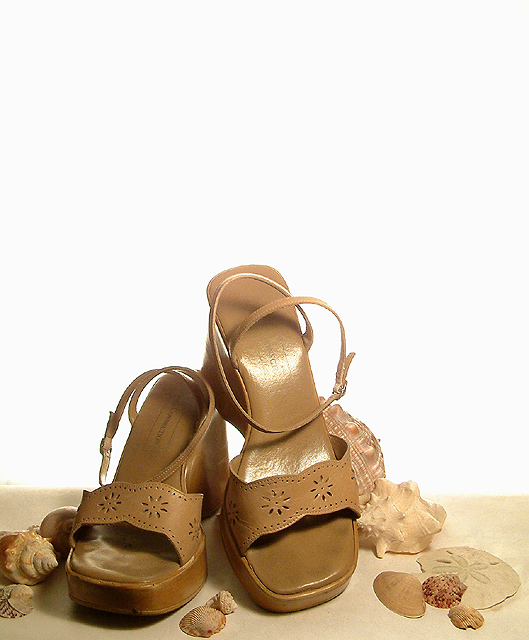
| I like this shot because the background is well lit, the almost-high-key works well too. I like the inclusion of the shells to give the shot something 'extra' nice job! |
|
 Photographer found comment helpful. Photographer found comment helpful. |
|
|
06/17/2003 10:48:33 AM |
| Nice composition, good use of white space and love the use of all similar colour objects. Lighting a little harsh on one sandal and shadowed on other. Could do with just a touch more space below toe at left of image - more sand. Even with magazine title and other text this would still retain that negative space feel. 8 |
|
| Photographer found comment helpful. |
|
|
06/16/2003 05:33:34 PM |
| Fits theme very nicely w/ white space @ top. |
|
| Photographer found comment helpful. |
|
|
06/16/2003 10:03:25 AM |
| I like this a lot... I love your use of negative space... I think it really works well. The transition from the sandy look on the bottom to the white is also very nice. Why did you choose to use shells in this photo? I don't think that these are the kind of sandals you would wear the the beach are they? I guess it's kind of a very interesting statement about how far people will go for fashion Ex. wearing these sandals to the beach. Your lighting is somewhat bothersome on the higher sandal... but not horrible, more bothersome is the dirt or whatever on the other sandal, though I suppose if they used this for a magazine cover people wouldn't be so anal about using some sort of cleaning up tool. Anyway.. I think this is kinda neat, I like the overall effect. |
|
| Photographer found comment helpful. |
|
|
06/14/2003 03:54:27 PM |
| Wonderful composition and single color focus. Exceptional technical quality. Including the shells makes this an exceptional image. |
|
| Photographer found comment helpful. |
|
|
06/14/2003 07:05:10 AM |
| Nice composition. There's a LOT of free space for type though. Perhaps the background could have been a bit more graduated, rather than blown out all the way down. |
|
| Photographer found comment helpful. |
|
|
06/14/2003 06:51:16 AM |
| nice, nice simple and effecive. Jacko. 9 |
|
| Photographer found comment helpful. |
|
|
06/13/2003 02:15:29 PM |
| Your photo only misses the text of the magazine :). This is a very nice picture with all the different shades of brown. Well done! |
|
| Photographer found comment helpful. |
|
|
06/12/2003 09:26:35 AM |
| Great shot, I love the sandels and sea shells. 9. |
|
| Photographer found comment helpful. |
|
|
06/11/2003 10:30:31 PM |
| Cool photo, but perhaps the top could have been cropped a bit more. There is a lot of white space. The shells add a nice touch. |
|
| Photographer found comment helpful. |
|
|
06/11/2003 09:19:07 PM |
| lot of sea shells there around the subject one shoe has some hot spots in it maybe different lighting would have been better details are there even the toe prints. |
|
| Photographer found comment helpful. |
|
|
06/11/2003 08:32:18 PM |
| With a setup like this, a blue backdrop would have been preferable to more closely mimic the beach setting. I'll assume your magazine exists; as a fashion magazine this is a reasonable setup. I don't know but that they might have chosen a more contrasting shoe colour and worked the text around it, though this way makes it easier for the copy compositor, certainly. Lots of space up top for copy, too. |
|
| Photographer found comment helpful. |
|
|
06/11/2003 12:34:19 PM |
| Great photo. Too much white space on the top though. |
|
| Photographer found comment helpful. |
|
|
06/11/2003 12:29:36 PM |
| nice picture.. but take care of light reflections.. |
|
| Photographer found comment helpful. |
|
|
06/11/2003 01:17:04 AM |
| Very good, although the reflecdtion on the shoe is a minus. |
|
| Photographer found comment helpful. |
Home -
Challenges -
Community -
League -
Photos -
Cameras -
Lenses -
Learn -
Help -
Terms of Use -
Privacy -
Top ^
DPChallenge, and website content and design, Copyright © 2001-2026 Challenging Technologies, LLC.
All digital photo copyrights belong to the photographers and may not be used without permission.
Current Server Time: 02/01/2026 10:26:00 AM EST.