| Author | Thread |
|
|
11/01/2005 12:38:56 PM |
| The photo on my screen is not too dark. |
|
|
|
11/01/2005 11:40:44 AM |
*Critique Club*
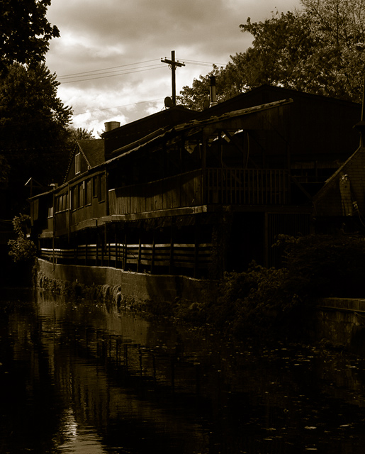
First of all... does it fit the challenge? Yes I believe it does... although there isn't quite as much reflection as some people would like... there is definitely reflection.
Now on to specifics.
First of all, I like the fact that you did this in sepia. I feel that if it had been in color, it definitely would not have had the same impact. The title also fits well with the fact that it's in sepia. It does look a tad scary.
This looks like a difficult subject to have played with compositionally. I feel that you did a pretty good job, although I might have liked a slightly more frontal look, or maybe more of the water with the reflection in it? I can't quite decide. The trees frame the house pretty well. One issue I'm having is that the image is primarily so dark, that I immediately go to the lightest part of the photo - the clouds and the sky, and the phone pole is very visible right there... that takes away from the old time, scary look for me.
As you can see from your comments you probably made this too dark. Exposure with a bright sky can be extremely difficult... but here it would have been really nice to see some of the details in the side of the house that is closest to us. I think the fact that we can't is somewhat of a problem... you might have been able to play around with this a bit in curves in Photoshop. Overall though lightening this image might have been beneficial to you.
I think that this is a nice start to a photo, but it's something you would have to play around with some more to get it just right. Good luck!
-Talya
|
|
 Photographer found comment helpful. Photographer found comment helpful. |
Comments Made During the Challenge  |
|
|
10/25/2005 07:56:44 PM |
|
|
|
10/25/2005 02:03:01 PM |
| the telephone pole over the building steals the focus of this photo away from the soft reflection in the water, imo. |
|
| Photographer found comment helpful. |
|
|
10/25/2005 11:47:31 AM |
|
| Photographer found comment helpful. |
|
|
10/25/2005 10:46:36 AM |
| a little too dark for me. |
|
| Photographer found comment helpful. |
|
|
10/24/2005 03:52:58 PM |
| Its a bit too dark, but a nice shot still |
|
| Photographer found comment helpful. |
|
|
10/24/2005 01:55:45 PM |
| way too underexposed and misscomposed |
|
|
|
10/23/2005 11:10:15 PM |
| Beautiful (maybe it should be a little more brighter...) |
|
| Photographer found comment helpful. |
|
|
10/23/2005 05:01:14 PM |
| I get more of a sense of silhouette than reflection in this picture. |
|
| Photographer found comment helpful. |
|
|
10/23/2005 03:56:25 PM |
| It looks like the camera metered the exposure for the background which was very bright. And I think that caused your main subject to be underexposed. Spot metering can be a little tricky. PM me if you want & I can give you a few tips on out-thinking the camera's AI. |
|
|
|
10/23/2005 06:19:57 AM |
|
|
|
10/22/2005 09:54:21 PM |
| Here's an example of one of the problems I have with my point-and-shooter. Exposing for the sky often leaves the foreground too dark, while exposing for the foreground blows out the sky. In this case, I would have opted for the latter and aimed a bit lower to focus more on the reflection than the sky. |
|
| Photographer found comment helpful. |
|
|
10/22/2005 01:18:31 PM |
| this looks a bit dark and hence lacks detail.. |
|
| Photographer found comment helpful. |
|
|
10/20/2005 03:39:45 PM |
|
|
|
10/20/2005 10:49:01 AM |
|
|
|
10/20/2005 10:12:12 AM |
|
|
|
10/19/2005 11:15:05 PM |
| 8...IMO, it would have been better a little bit brighter! |
|
| Photographer found comment helpful. |
|
|
10/19/2005 10:16:13 AM |
| a litle TOO dark for my tastes, but nice tones.Composition works well, and with the title the powerlines appear as a cross...was this deliberate? |
|
| Photographer found comment helpful. |
|
|
10/19/2005 09:55:30 AM |
| Way too dark. very difficult to see any shadow detail. |
|
| Photographer found comment helpful. |
|
|
10/19/2005 04:52:00 AM |
| My favorite part of your photo is the left half. For me, I wish there was a bit more contrast on the right hand side as it is so dark, but I like the tones you chose to use. |
|
| Photographer found comment helpful. |
Home -
Challenges -
Community -
League -
Photos -
Cameras -
Lenses -
Learn -
Help -
Terms of Use -
Privacy -
Top ^
DPChallenge, and website content and design, Copyright © 2001-2025 Challenging Technologies, LLC.
All digital photo copyrights belong to the photographers and may not be used without permission.
Current Server Time: 04/07/2025 12:21:41 AM EDT.