| Author | Thread |
|
|
10/26/2005 08:45:20 AM |
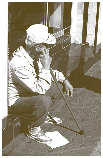
Thanks to all thoses who left comments. All are helpful to me but there is also an element of style. I like the effect that toning down the blacks does. It give a certain warmness and broken in feel to the pictures. When they are printed and mounted they do look a little better then online. This being said I am not going to change my style anytime soon, hee hee... But I will take into consideration other peoples comments.
Cheers,
Eric... |
|
Comments Made During the Challenge  |
|
|
10/25/2005 11:19:41 PM |
| a little unclear i think but i like the color of it,it makes it look like an older type photograph and i like the whole idea.8 |
|
 Photographer found comment helpful. Photographer found comment helpful. |
|
|
10/23/2005 07:57:31 AM |
| looks a bit too bright, would look better with more contrast and sharpening may be. |
|
| Photographer found comment helpful. |
|
|
10/23/2005 01:22:56 AM |
| Poor guy! Excellent composition and perspective. To me the lighting appears a little flat, the image faded and lacking in blacks. |
|
| Photographer found comment helpful. |
|
|
10/22/2005 09:02:27 PM |
| I like the composition, but for me, the overall photo is too light or faded out. I'd like to see a bit more contrast. Also the white border fades into the large white area on the left and I wonder how this would have looked with a dark border instead? |
|
| Photographer found comment helpful. |
|
|
10/22/2005 08:23:00 AM |
| Could have been a 7 or 8 with some tonality adjustments. As presented, I have to give it a 3 cuz it doesn't look 'finished'. Good comp, though! |
|
| Photographer found comment helpful. |
|
|
10/21/2005 07:58:29 PM |
| Very nice...Great job..!! |
|
| Photographer found comment helpful. |
|
|
10/21/2005 09:18:53 AM |
| A more serious take on the question- very nice! |
|
| Photographer found comment helpful. |
|
|
10/19/2005 10:27:49 PM |
| Descent shot, but too washed out. More contrast and a different angle would make the shot much more interesting. |
|
| Photographer found comment helpful. |
|
|
10/19/2005 05:54:56 AM |
my favorite in the challenge.
So simple, but makes me stop and ask myself what is he thinking of.
meets the challenge so perfectly.
I love the hazy look of no blacks against blown out whites.
Well done! |
|
| Photographer found comment helpful. |
Home -
Challenges -
Community -
League -
Photos -
Cameras -
Lenses -
Learn -
Help -
Terms of Use -
Privacy -
Top ^
DPChallenge, and website content and design, Copyright © 2001-2026 Challenging Technologies, LLC.
All digital photo copyrights belong to the photographers and may not be used without permission.
Current Server Time: 02/01/2026 09:17:19 AM EST.