| Author | Thread |
Comments Made During the Challenge  |
|
|
06/17/2003 04:06:29 PM |
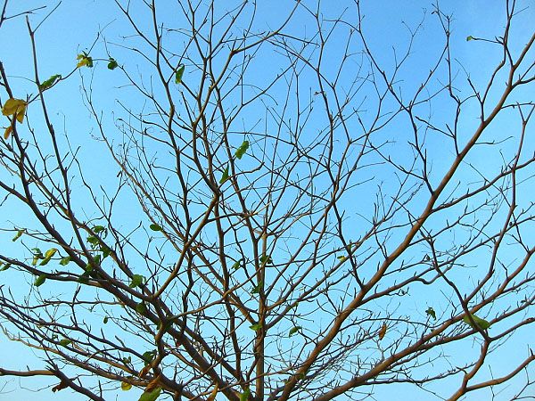
| Feels a little too sparse to be on the cover of Nature Magazine. On it's own it's not a bad shot, there just isn't much going on; my eyes aren't drawn to any particular place in the picture. |
|
 Photographer found comment helpful. Photographer found comment helpful. |
|
|
06/14/2003 03:37:15 PM |
| The photo lacks a central theme to it (other than being a picture of a tree). Perhaps focusing on a particular aspect of the tree would give it a stronger feel to it. |
|
| Photographer found comment helpful. |
|
|
06/14/2003 12:32:38 PM |
| Hmmm. Dont like how the tree is totally cropped out of the photo. Get a lot more, if not all, of it in the fame next time. There's not much of interest here for potential viewers, except maybe the fractal-like pattern of the branches. Nevertheless, I think this could have been shown bettern in other ways. |
|
| Photographer found comment helpful. |
|
|
06/12/2003 12:54:14 PM |
| looks like a late spring shot. |
|
|
|
06/11/2003 09:02:12 AM |
| Different cropping might have allowed me to see it differently, but it just doesn't look like a magazine cover to me. |
|
| Photographer found comment helpful. |
|
|
06/10/2003 09:21:22 PM |
| This should be in portrait not landcape. Don't like the cropping. |
|
| Photographer found comment helpful. |
|
|
06/10/2003 08:29:36 PM |
| looks like a shot i would take , so i am partial to it. nice job |
|
| Photographer found comment helpful. |
Home -
Challenges -
Community -
League -
Photos -
Cameras -
Lenses -
Learn -
Help -
Terms of Use -
Privacy -
Top ^
DPChallenge, and website content and design, Copyright © 2001-2025 Challenging Technologies, LLC.
All digital photo copyrights belong to the photographers and may not be used without permission.
Current Server Time: 04/07/2025 12:51:49 PM EDT.