| Author | Thread |
Comments Made During the Challenge  |
|
|
06/17/2003 07:14:26 PM |
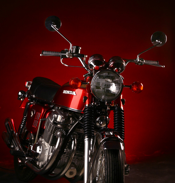
| Great bike photo. Nice job. Not sure if you matched the background to the bike color, but if you did...Nice work. Great accent (directional) lighting on the chrome. |
|
|
|
06/17/2003 01:16:07 PM |
| There you guys go again. You people with you fancy studios and fancy lights and fancy camera. Soe of us just can't compete. =) Just giving you a hard time. This a Perfect 10 withouth a doubt. |
|
|
|
06/17/2003 02:26:43 AM |
| Great concept, but where is the rest of the bike? |
|
|
|
06/15/2003 07:01:09 PM |
| I would have prefered to see the whole bike. |
|
|
|
06/14/2003 08:23:56 AM |
| Just the right shade of background read lighting for your bike. |
|
|
|
06/14/2003 03:49:52 AM |
|
|
|
06/14/2003 03:23:50 AM |
| Remarkable image. Wonderful lighting technique used and choice of subject. The colour is just perfect too. Nicely composed. GL in this weeks challenge. |
|
|
|
06/14/2003 02:49:16 AM |
| Fabulous lighting! I would have liked to see the whole bike in the picture though. The dirty floor detracts a little too. 8 |
|
|
|
06/13/2003 12:27:16 PM |
| Lighting is not great. Feels lop-sided. A different angle might have helped. Background is good for the magazine though. Not bad. A good attempt. |
|
|
|
06/13/2003 11:21:01 AM |
| Very good idea, and I really like the background and the lighting. The only thing I would change would be to not have the front tire cropped off. As is, it's still a good picture. |
|
|
|
06/13/2003 03:24:35 AM |
| i wish you hadn't cut the lower part of the bike off... |
|
|
|
06/12/2003 10:10:47 PM |
| Shot is tilted to the right. |
|
|
|
06/12/2003 09:42:41 PM |
| Gorgeous lighting! Someone at Hondda should pay you for this shot! |
|
|
|
06/12/2003 07:49:45 AM |
| Amazingly well lit - this is very hard to pull off. Fantastic background, as well. I'd love to be able to see the whole bike, though. |
|
|
|
06/11/2003 09:10:10 PM |
|
|
|
06/11/2003 07:02:17 PM |
| I think this shot looks great. The colors really make this shot. If the background was not the way it is, it would not work as well. |
|
|
|
06/11/2003 06:25:42 PM |
| This is a really nice photo of a honda, the only thing I don't like is the tires are cut off in the picture. I do like the background you choose and the clean lines you have depicted here! :) 8 |
|
|
|
06/11/2003 08:23:48 AM |
| This is the first photograph I have seen in this challenge that actually looks like it might be on a magazine cover. I would have liked to have seen it taken from a different angle so that the entire motorcycle would have been in the frame. |
|
|
|
06/11/2003 08:13:35 AM |
| I don't really like how the bottom of the bike is cut off. Seems a little clumbsy. Other than that...I really like the background and the angle at which you took the shot. |
|
|
|
06/11/2003 07:58:13 AM |
| A great, crisp shot! I love the red backdrop. I would have liked to have seen a more full shot of the bike, with more of the front wheel, though. - 7 |
|
|
|
06/10/2003 11:10:51 PM |
| Why cut off the front wheel like that? |
|
|
|
06/10/2003 09:11:12 PM |
| Wow, i just want to know where you found this bike? It's immaculate! |
|
|
|
06/10/2003 09:08:17 PM |
great photo, I like the dark red colors, why crop the tire out?
JB |
|
|
|
06/10/2003 09:02:17 PM |
| very nice, although I'd like to see the entire bike. focus seems a touch soft. 7 |
|
Home -
Challenges -
Community -
League -
Photos -
Cameras -
Lenses -
Learn -
Help -
Terms of Use -
Privacy -
Top ^
DPChallenge, and website content and design, Copyright © 2001-2025 Challenging Technologies, LLC.
All digital photo copyrights belong to the photographers and may not be used without permission.
Current Server Time: 04/07/2025 02:52:51 AM EDT.