| Author | Thread |
Comments Made During the Challenge  |
|
|
10/16/2005 11:28:51 AM |
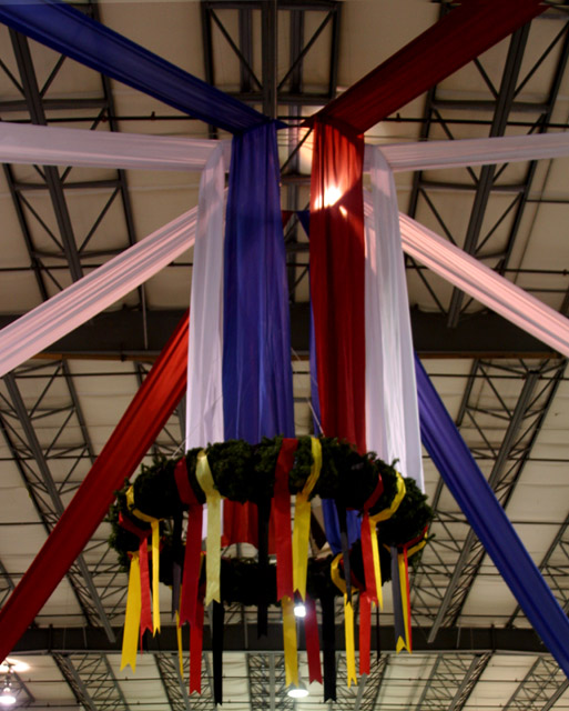
| The roof trusses really spoil this ... bit hard to get rid of them though I guess |
|
 Photographer found comment helpful. Photographer found comment helpful. |
|
|
10/16/2005 07:27:36 AM |
| a little bit out of focus |
|
| Photographer found comment helpful. |
|
|
10/11/2005 07:52:01 PM |
| Nice and colorful image. The background is distracting though :( |
|
| Photographer found comment helpful. |
|
|
10/11/2005 02:07:27 PM |
|
| Photographer found comment helpful. |
|
|
10/11/2005 01:41:08 PM |
| the angle from which the photo was shot has the hanging wreath off-center. i keep wanting to push it over to the right to center it out... |
|
| Photographer found comment helpful. |
|
|
10/11/2005 11:04:34 AM |
| good perspective - though seems uniformly 'dull' / unsharp |
|
| Photographer found comment helpful. |
|
|
10/10/2005 06:07:39 PM |
|
|
|
10/10/2005 10:46:03 AM |
| I like the decorations themselves, but I find the lines of the decorations combined with the lines of the ceiling kind of conflict for me visually. Also, the ceiling lights are distracting (although I know you couldn't help those being there). |
|
| Photographer found comment helpful. |
|
|
10/10/2005 08:46:51 AM |
| A bit out of focus and underexposed. I like the composition with the banners, but the lights in the background are distracting. I'd suggest cropping the left and right sides evenly to eliminate the light on the left and cropping the bottom to get rid of the bottom light (even at the expense of cutting off part of the ribbons). Additionally, the color balance is a little off - the white banners have a pink shade to them. |
|
| Photographer found comment helpful. |
|
|
10/10/2005 04:21:20 AM |
| It looks a little soft to me. |
|
Home -
Challenges -
Community -
League -
Photos -
Cameras -
Lenses -
Learn -
Help -
Terms of Use -
Privacy -
Top ^
DPChallenge, and website content and design, Copyright © 2001-2025 Challenging Technologies, LLC.
All digital photo copyrights belong to the photographers and may not be used without permission.
Current Server Time: 04/07/2025 02:15:18 AM EDT.