| Author | Thread |
Comments Made During the Challenge  |
|
|
10/16/2005 07:48:48 AM |
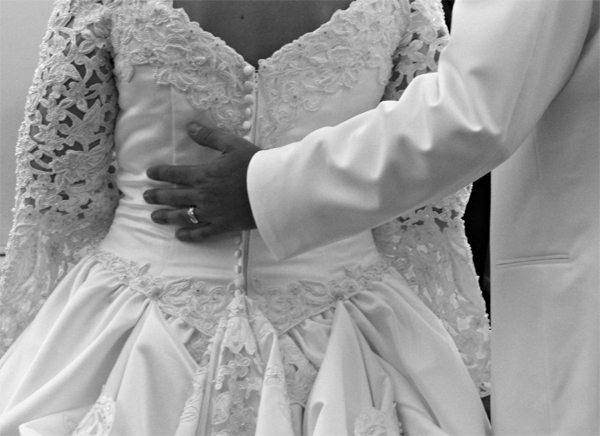
| a bit out of focus, but I like the B&W! |
|
|
|
10/15/2005 06:09:02 PM |
| I like your concept for celebration. For me, I think a bit more contrast and overall focus would increase the impact. |
|
|
|
10/14/2005 05:03:56 PM |
clarity/contrast/color: 1/2
composition,POV,DOF: 1/2
effort+originality: 1/2
theme appropriate: 2/2
aesthetic timelessness+emotion: 1/2 |
|
|
|
10/14/2005 02:04:11 PM |
| Nice and simple, excellent. |
|
|
|
10/14/2005 05:12:01 AM |
| this shot fits the challenge well but since we can't see their faces, it might have been improved if they were standing closer, he was gripping her harder, etc. as a technical note, this looks a bit underexposed to me, with the hand too featureless and the whites too drab. still, a nice attempt! |
|
|
|
10/12/2005 07:16:42 AM |
|
|
|
10/11/2005 01:39:17 PM |
| interesting compesition, focusing on the hand on her back. i would have liked to see greater contrast in your b&w, so that the dress details really pop and his hand really stands out. |
|
|
|
10/11/2005 11:23:12 AM |
| karen looks like she is listing to the right |
|
|
|
10/11/2005 10:51:38 AM |
| this image is a bit flat. The whites are still in the grey range. conposition is good tho. |
|
|
|
10/11/2005 09:08:10 AM |
| nice entry just needs to be sharper. |
|
|
|
10/10/2005 06:09:37 PM |
|
|
|
10/10/2005 11:41:52 AM |
| Flat and not very interesting. |
|
Home -
Challenges -
Community -
League -
Photos -
Cameras -
Lenses -
Learn -
Help -
Terms of Use -
Privacy -
Top ^
DPChallenge, and website content and design, Copyright © 2001-2025 Challenging Technologies, LLC.
All digital photo copyrights belong to the photographers and may not be used without permission.
Current Server Time: 04/07/2025 01:24:59 PM EDT.