| Author | Thread |
Comments Made During the Challenge  |
|
|
06/17/2003 08:52:43 PM |
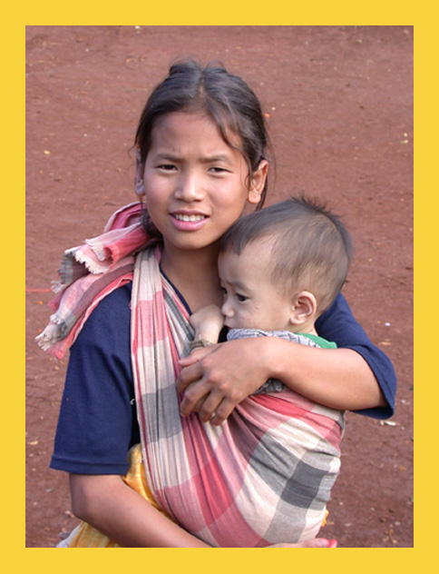
| Colors are a bit washed, but sure, this is a great shot for NG! Very nice capture and composition/cropping. Lighting is nice, too. |
|
 Photographer found comment helpful. Photographer found comment helpful. |
|
|
06/17/2003 02:21:26 PM |
| Very nice image. Seems like a NG cover to me! Color seems a little low (increase the saturation a touch or two), but not bad. Focus seems pretty good. Compositionally - I think I've seen NG covers that looked pretty near to this, good work!!! 9 Rob the Swash |
|
| Photographer found comment helpful. |
|
|
06/17/2003 01:57:53 PM |
| Of all the Natioanl Geographic covers here, yours is the one that feels most appropriate. It's a pity it's slightly out of focus. Nice job otherwise. |
|
| Photographer found comment helpful. |
|
|
06/17/2003 11:08:09 AM |
| Totally hit the spot ... I can absolutely see this on the cover of a magazine. As a photo, evokes a lot of emotion, which is good, plus is well executed. I wouldn't be surprised if you got a ribbon for this one ... (10) |
|
| Photographer found comment helpful. |
|
|
06/17/2003 10:10:19 AM |
Very much the right style for the magazine. I think this is an excellent image in many ways. Great eye contact and wonderful emotional connection with the subjects.
Feels cropped a little too tight at the bottom - I'd like to see all of her arm/ hand in the shot.
The strong highlight on her nose is also a little distracting.
8 |
|
| Photographer found comment helpful. |
|
|
06/17/2003 05:11:11 AM |
| I wouldn't have used National Geographic for this title. I think Life would've been a more suitable choice. A pretty nice photo aside from being a little soft |
|
| Photographer found comment helpful. |
|
|
06/16/2003 08:36:36 PM |
| Yes, exactly. I am waiting to read this issue. Spot-on. |
|
| Photographer found comment helpful. |
|
|
06/16/2003 05:38:44 PM |
| now this is more like the national geographic entry. 10 |
|
| Photographer found comment helpful. |
|
|
06/16/2003 12:12:10 AM |
| BEst Nation Geo Shot, thats a Cover-- 10 |
|
| Photographer found comment helpful. |
|
|
06/15/2003 12:38:39 PM |
| Subject & background = perfect - this could be on a cover. |
|
| Photographer found comment helpful. |
|
|
06/15/2003 09:22:25 AM |
| I think you have made one of the best cover shots for NG during this challenge. The background is not too busy, the expression on your subjects is very 'NG-like'. The only thing missing is the cover text :). Definitely a 10! |
|
| Photographer found comment helpful. |
|
|
06/14/2003 07:01:05 PM |
| Nice work with the border =). It would have been nice to have something other than the ground in the back to give a stronger context for the picture. |
|
| Photographer found comment helpful. |
|
|
06/14/2003 08:31:49 AM |
| Looks like a National Geographic picture to me. 9. |
|
| Photographer found comment helpful. |
|
|
06/13/2003 06:57:20 PM |
| Perfect. Just perfect. I love the angle and framing/cropping. The focus and clarity are really good, and lighting is nice as well. Great shot for the NG. If I had to make a suggestion it would be to have included the rest of the girls arm at the bottom, but not absolutely needed. great shot. |
|
| Photographer found comment helpful. |
|
|
06/13/2003 04:59:12 PM |
| Yup. That looks like a National Geographic cover. Nicely done. |
|
| Photographer found comment helpful. |
|
|
06/13/2003 10:53:53 AM |
| this is just perfect "National Geographic" cover, 10! |
|
| Photographer found comment helpful. |
|
|
06/13/2003 08:18:33 AM |
| some parts of the ladies face is a little bit white areas. IMO maybe image would be better if you crop below her right hand and fill up frame more with their heads. = 4 |
|
| Photographer found comment helpful. |
|
|
06/13/2003 02:16:45 AM |
| I like very much this one... I love the expression of the girl |
|
| Photographer found comment helpful. |
|
|
06/12/2003 10:15:00 PM |
| This is my favorite shot in the entire competition because it actually LOOKS like a National Geographic magazine cover! The only detraction for me is the soft focus, but it still gets a 9 from me. Congratulations - it's wonderful. |
|
| Photographer found comment helpful. |
|
|
06/12/2003 06:04:01 PM |
| really, really, really nice... |
|
| Photographer found comment helpful. |
|
|
06/12/2003 09:13:18 AM |
| NGMish photo but lacks the NGM look ... Levels adjustment, .9 Gamma and +10 saturation across the board would have done wonders for this photo, IMHO. |
|
| Photographer found comment helpful. |
|
|
06/12/2003 06:01:05 AM |
| There are two really good NG type covers in this challenge this is absolutlely one of them.. Great emotions!! |
|
| Photographer found comment helpful. |
|
|
06/12/2003 01:23:24 AM |
| a little more contrast would make it perfect. great shot. |
|
| Photographer found comment helpful. |
|
|
06/11/2003 09:43:19 PM |
| This definately looks like a National Geographic Magazine cover. I would like to know who these kids are. Are you sure that they weren't already on a magazine cover? :-) |
|
| Photographer found comment helpful. |
|
|
06/11/2003 06:14:17 PM |
|
| Photographer found comment helpful. |
|
|
06/11/2003 03:55:44 PM |
| It's too bad the subject looks slightly out of focus, this really could have been great. I like the subject here, could definitely fit on National Geographic, although I feel shooting down was not the best way to capture this... I think that getting down and shooting up might have been more effectual for this shot. Just my opinion though. Great subject for the challenge. |
|
| Photographer found comment helpful. |
|
|
06/11/2003 01:49:21 PM |
| Photos is a bit overexposed. There isn't room at the top for the magazine title. Otherwise the photo is very good. |
|
| Photographer found comment helpful. |
|
|
06/11/2003 12:11:25 PM |
| Looks like the real deal! |
|
| Photographer found comment helpful. |
|
|
06/11/2003 11:03:14 AM |
| It really does look like an issue of National Geographic! Seems like there's just a teeny bit too much headroom here, but it's a great shot. |
|
| Photographer found comment helpful. |
|
|
06/11/2003 07:16:54 AM |
| Excellent photo and a clever adaption of the theme |
|
| Photographer found comment helpful. |
|
|
06/11/2003 06:54:31 AM |
|
| Photographer found comment helpful. |
|
|
06/11/2003 01:08:56 AM |
| Very nice, although the focus is a little soft. |
|
| Photographer found comment helpful. |
Home -
Challenges -
Community -
League -
Photos -
Cameras -
Lenses -
Learn -
Help -
Terms of Use -
Privacy -
Top ^
DPChallenge, and website content and design, Copyright © 2001-2026 Challenging Technologies, LLC.
All digital photo copyrights belong to the photographers and may not be used without permission.
Current Server Time: 02/01/2026 12:01:06 PM EST.