| Author | Thread |
|
|
06/20/2003 01:18:52 AM |
| Yep, this should have done better. Maybe if it was a Cohiba... ;) |
|
 Photographer found comment helpful. Photographer found comment helpful. |
|
|
06/18/2003 08:09:23 AM |
| Awesome shot. Should have faired better. |
|
| Photographer found comment helpful. |
|
|
06/18/2003 01:51:51 AM |
| Yeah... you got robbed dude. Just goes to show: people vote higher for things they "recognize". Baskeball shots have been done millions of time. Sure it's a nice shot. But does it belong at number 1? Not compared to your shot. (ok ok, not nice to compare... but sorry, it's true! You deserved it.) |
|
| Photographer found comment helpful. |
|
|
06/18/2003 01:00:39 AM |
| Man... i think you got robbed! IMO, this was the best of them all. |
|
| Photographer found comment helpful. |
Comments Made During the Challenge  |
|
|
06/17/2003 09:00:52 PM |
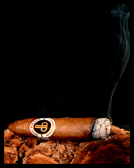
| Cigar lovers have to love this one. Clear, crisp and interesting. |
|
| Photographer found comment helpful. |
|
|
06/17/2003 10:59:58 AM |
| Beautiful tendril of smoke, lovely rich colours, good lighting and nice focus. I like that even with magazine text this image would still allow for a feeling of negative space. 10 |
|
| Photographer found comment helpful. |
|
|
06/17/2003 09:38:56 AM |
Fits the requirements for a good cover shot to be used with multiple type additions.
Nice detail... |
|
| Photographer found comment helpful. |
|
|
06/17/2003 05:40:42 AM |
one word... WOW !
Perfect color and lighting ! Original and so well done. |
|
| Photographer found comment helpful. |
|
|
06/17/2003 04:00:29 AM |
| Love the wisp of smoke, very well done. My one and only complaint is the cigar is not contrasted well with the object it is on. |
|
| Photographer found comment helpful. |
|
|
06/16/2003 09:07:47 PM |
| Nice photo, but too much negative space for me. Nice browns. |
|
|
|
06/15/2003 07:00:22 PM |
| LOVE that negative space. |
|
| Photographer found comment helpful. |
|
|
06/15/2003 06:58:09 AM |
| I like your setting for a unique picture, the only thing that I would change is to try to get a wooden base that was not as close in colour to the cigar. |
|
| Photographer found comment helpful. |
|
|
06/15/2003 01:18:00 AM |
| Nice shot more smoke would be better. Maybe and hot ash. |
|
| Photographer found comment helpful. |
|
|
06/14/2003 05:26:20 PM |
| The lighting is nice, you reproduced the brown hues pretty well. The wood or whatever this cigar is resting on is kind of hard to make out. I would remove it from the picture next time, too confusing. |
|
| Photographer found comment helpful. |
|
|
06/14/2003 03:52:58 PM |
| Beautifully captured image. Great lighting. Extreamly high technical quality. |
|
| Photographer found comment helpful. |
|
|
06/13/2003 11:58:22 PM |
| Great example of a picture that would make a great magazine cover just as is. Great lighting, composition, and enough room for text. The shadow on the lower right bothers me just a bit but still an excellent photo. |
|
| Photographer found comment helpful. |
|
|
06/13/2003 03:40:24 PM |
| I can see it on the shelves now. Good shot of the cigar. Not too much of it there.. not too little. Very nice. |
|
| Photographer found comment helpful. |
|
|
06/13/2003 01:32:29 PM |
| Pretty good shot. But maybe instead of the black background you should have used an abstract, soft background to give the mag cover more interest. |
|
| Photographer found comment helpful. |
|
|
06/13/2003 02:02:30 AM |
| interesting cigar tray... I love the pattern of the smoke... |
|
| Photographer found comment helpful. |
|
|
06/12/2003 04:52:34 PM |
| too much black, but I like the cigar shot. |
|
| Photographer found comment helpful. |
|
|
06/12/2003 11:03:28 AM |
excellent shot. superb coors. excellent use of negative space. very well done. one of my two 10s this week.
|
|
| Photographer found comment helpful. |
|
|
06/11/2003 09:57:43 PM |
| wow! excellent photo! the tones of the cigar and the wood compliment each other well and the whisp of smoke is a nice touch! well done! |
|
| Photographer found comment helpful. |
|
|
06/11/2003 09:01:40 PM |
| Precisely the type of thing I've seen on Cigar magazines. I don't know yours in particular but other versions have had items like this. Lots of negative space at the top seems common, lots of room for the text. Close-up to show the brand and style is also common. I can easily see it. Good job. |
|
| Photographer found comment helpful. |
|
|
06/11/2003 06:57:23 PM |
| a half smoked cigar with the brand band still on I like the contrast in the image. |
|
| Photographer found comment helpful. |
|
|
06/11/2003 05:24:38 PM |
| What a great shot! perfect focus and lighting, and excellent DOF. The black background really helps to highlight the cigar smoke. The onli knitpick I have (and it's a very small one) would have been to either move the cigar to the left or crop less off the right, just so the smoke wasn't cut off. But like I said, the picture absolutely excellent as is and definately one of the week's best. |
|
| Photographer found comment helpful. |
|
|
06/11/2003 02:08:40 PM |
| I love the lighting on this photo. It really highlights your subject. I can easily see it as a magazine cover since you have left plenty of room for title and article information. I didn't notice the smoke coming off the cigar at first but it's a cool little detail that adds interest. A very nice shot. One of my favorites! |
|
| Photographer found comment helpful. |
|
|
06/11/2003 01:27:29 PM |
| Perfection! I used to subscribe to this magazine, actually. I can definitely see this - if not on their cover, at least inside somewhere. Gorgeous lighting, fantastic composition, beautiful rich tones. Makes me want to light up a stogie and have a good glass of single malt. :) 10 |
|
| Photographer found comment helpful. |
|
|
06/11/2003 01:25:20 PM |
| This is a great photo that really fits the challenge... plenty of space for type, very well done. Not sure I would have put the black border, but I don't think it detracts substantially from the photo... The whisps of smoke produced by the cigar are pretty much "picture perfect" very nicely done! |
|
| Photographer found comment helpful. |
|
|
06/11/2003 01:08:29 PM |
| Simple and classy. I have no idea if that's a good brand of cigar or not, but it's something I'm sure would appear on your chosen magazine. I think the cigar is on some bark or maybe it's the leaves or something, but whatever it is I like the texture and color, very complimentary to the cigar. The trail of smoke leads upwards to where I assume the title would be. Great image! |
|
| Photographer found comment helpful. |
|
|
06/11/2003 01:05:26 PM |
| The cigar seems to blend right in to the stand. I would have liked a bit more of a contrast |
|
| Photographer found comment helpful. |
|
|
06/11/2003 09:13:13 AM |
| everything looks good. i think it would have been more effective if the smoke was thicker and more visually present. = 8 |
|
| Photographer found comment helpful. |
|
|
06/11/2003 01:16:07 AM |
| Very nice, very nice. I can't find anything to fault here. This is the one. This will take gold this week. 10. |
|
| Photographer found comment helpful. |
|
|
06/11/2003 12:59:25 AM |
| Oh man, this is nice! that smoke just sets it off good, nice & sharp too... |
|
| Photographer found comment helpful. |
Home -
Challenges -
Community -
League -
Photos -
Cameras -
Lenses -
Learn -
Help -
Terms of Use -
Privacy -
Top ^
DPChallenge, and website content and design, Copyright © 2001-2026 Challenging Technologies, LLC.
All digital photo copyrights belong to the photographers and may not be used without permission.
Current Server Time: 02/01/2026 11:03:34 AM EST.