| Author | Thread |
Comments Made During the Challenge  |
|
|
06/17/2003 02:22:53 PM |
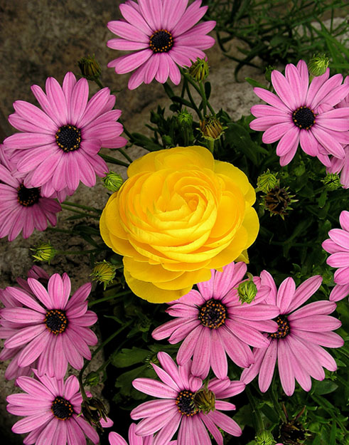
Pretty, contrasting flowers. Very nice color. Lighting - just a touch dark overall, but much lighter would have made the yellow a bit too harsh. Nice image.
9 Rob the Swash |
|
 Photographer found comment helpful. Photographer found comment helpful. |
|
|
06/17/2003 11:06:21 AM |
| Wonderful flowers, but the rose looks totally out of place. I suspect that\'s just what you wanted to achieve, but it still looks very strange to me. But, your focus and lighting is very good. I generally like the \"odd one out\" idea, maybe if you had placed the rose not in the center of the image ... dunno. (5) |
|
| Photographer found comment helpful. |
|
|
06/17/2003 07:08:17 AM |
| Lovely colours but not so keen on the central composition - feels a little unbalanced to me. |
|
| Photographer found comment helpful. |
|
|
06/17/2003 12:27:31 AM |
| Each flower type is pretty good, but the combination is, uh, unusual. I think simpler is better. |
|
| Photographer found comment helpful. |
|
|
06/16/2003 06:01:50 PM |
| nice shoot.. it would be better if you follow the 3 third rule.. |
|
| Photographer found comment helpful. |
|
|
06/16/2003 12:58:23 PM |
| This is picky, but I'd like to see the yellow flower more off center. I think that if you were to crop off the top right below the top most flower, this would bring the yellow flower up toward the top a bit, and would also remove the green tangle in the upper right corner that I find to be a bit distracting. Colors are good, as is focus and clarity. |
|
| Photographer found comment helpful. |
|
|
06/14/2003 12:22:50 PM |
| Exceptionally welll composed shot wit the yellow rose surrounded by pink daisys. Would work well as a cover for you magazine. |
|
| Photographer found comment helpful. |
|
|
06/14/2003 07:55:31 AM |
| Great image, suits the theme of this week's challenge very well. 8 Morgan |
|
| Photographer found comment helpful. |
|
|
06/14/2003 06:18:26 AM |
| Lovely colours. It looks more like a flower arrangement than a garden though. Perhaps a different perspective would have matched the magazine title better? 7 |
|
| Photographer found comment helpful. |
|
|
06/13/2003 08:53:20 AM |
| nice composition and colors! = 8 |
|
| Photographer found comment helpful. |
|
|
06/11/2003 05:59:05 AM |
The top flower bothers me a little since the title usually goes on top.
Good shot of the flowers. |
|
| Photographer found comment helpful. |
Home -
Challenges -
Community -
League -
Photos -
Cameras -
Lenses -
Learn -
Help -
Terms of Use -
Privacy -
Top ^
DPChallenge, and website content and design, Copyright © 2001-2026 Challenging Technologies, LLC.
All digital photo copyrights belong to the photographers and may not be used without permission.
Current Server Time: 02/01/2026 12:23:56 PM EST.