| Author | Thread |
Comments Made During the Challenge  |
|
|
10/11/2005 03:38:55 PM |
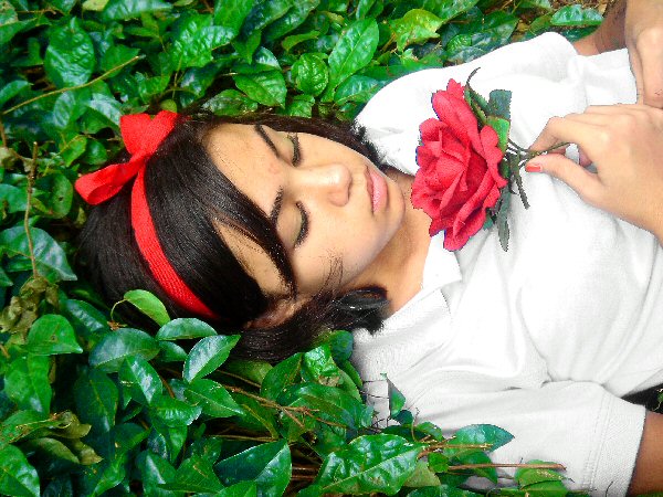
| Nice idea, the white shirt is too bright for this picture I think |
|
 Photographer found comment helpful. Photographer found comment helpful. |
|
|
10/11/2005 02:13:06 AM |
| I like the concept of this photo but the rose looks like it was added to the photo. |
|
| Photographer found comment helpful. |
|
|
10/10/2005 07:10:24 PM |
| Sharpening looks a bit odd... But I still love the shot. Great angle and composition. |
|
| Photographer found comment helpful. |
|
|
10/09/2005 11:00:20 PM |
|
| Photographer found comment helpful. |
|
|
10/09/2005 11:21:10 AM |
| Nice unique subject. However, the white is really distracting and the image appears to be oversharpened |
|
| Photographer found comment helpful. |
|
|
10/08/2005 11:39:47 PM |
| Love the composition. Looks a bit oversharpened. I'm noticing artifacts in the hair and around the flower and hands on the shirt. |
|
| Photographer found comment helpful. |
|
|
10/08/2005 04:58:36 PM |
| Nice picture but it seems really highly aliased, like it was scaled down with nearest-neighbor or something. Too bad, otherwise it's a great photo. |
|
| Photographer found comment helpful. |
|
|
10/08/2005 12:43:43 PM |
|
| Photographer found comment helpful. |
|
|
10/07/2005 11:14:11 PM |
| The edges look way too crisp on my monitor, I think you oversharpened it. |
|
| Photographer found comment helpful. |
|
|
10/07/2005 01:45:06 PM |
| Nice shot but it looks too processed. |
|
| Photographer found comment helpful. |
|
|
10/06/2005 06:57:38 PM |
| need to back-off the sharpening ... too many jaggies |
|
| Photographer found comment helpful. |
|
|
10/06/2005 12:43:25 PM |
| seems oversharpened to me? but nice idea and composition |
|
| Photographer found comment helpful. |
|
|
10/06/2005 01:18:47 AM |
|
| Photographer found comment helpful. |
|
|
10/05/2005 03:44:36 PM |
| at least rotate the photo ! |
|
|
|
10/05/2005 12:33:38 PM |
| I see the red and green. The image looks oversharpened to me, and the white shirt really throws the image off balance. Still, your subject is in a nice position in the frame, and the idea is cretive. Not to mention the clear use of red and green complimetary colors. |
|
| Photographer found comment helpful. |
|
|
10/05/2005 11:48:32 AM |
| nice image; beutiful model; i think some parts of the pic are overprocessed - too much USM? |
|
| Photographer found comment helpful. |
|
|
10/05/2005 10:07:24 AM |
| there's a lot of white noise on this photo... did you oversharpen or something? |
|
| Photographer found comment helpful. |
|
|
10/05/2005 08:10:12 AM |
| Great photo, I particularly like the ribbon against the dark hair amongst the green. |
|
| Photographer found comment helpful. |
|
|
10/05/2005 07:59:44 AM |
| What a clever imagination. I like that it isn't a leaf or a sunset. LOL I like that her bangs separate and you can see part of her forehead. If the rose and the ribbon were exactly the same color, that would be really cool, but no deductions because they aren't. the composition is good. I might crop so you didn't see that tiny bit of skin on her upper right arm. I'd have her remove her nail polish, but that's just little nit pick stuff. Overall - well composed, imagined and executed. |
|
| Photographer found comment helpful. |
|
|
10/05/2005 03:59:54 AM |
| The colors in this are very nice, but the image has been badly over sharpened. |
|
| Photographer found comment helpful. |
|
|
10/05/2005 02:29:55 AM |
| Looks a tad over sharpened. Good luck |
|
| Photographer found comment helpful. |
Home -
Challenges -
Community -
League -
Photos -
Cameras -
Lenses -
Learn -
Help -
Terms of Use -
Privacy -
Top ^
DPChallenge, and website content and design, Copyright © 2001-2026 Challenging Technologies, LLC.
All digital photo copyrights belong to the photographers and may not be used without permission.
Current Server Time: 02/01/2026 11:41:08 AM EST.