| Author | Thread |
|
|
06/24/2003 07:53:50 PM |
*Critique Club*
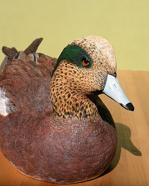
What stands out to me most is the shadow. I think it's a bit distracting. I think that with different lighting, not only would it help fix the shadow, but also help to bring out the colors a bit more in your image.
The horizontal line in your background isn't horizontal, which is also distracting.
I think I would have placed the subject on something other than a wooden table. Having it on wood, distracts from it being wood. Just too much wood to focus on just one of the wooden subjects. Table or Duck.
I also wonder how this would be as a close up. Maybe of just the head. I think it would show the detail a lot better and accentuate the fact that it's carved.
Your focus and clarity are good, but because of the lighting, we lose some of the detail on the top of his head.
Overall, the subject could definately be on the front cover, and with some minor adjustments, the photo as well.
~Heather~ |
|
 Photographer found comment helpful. Photographer found comment helpful. |
|
|
06/18/2003 11:10:16 AM |
| Thank you all for your comments and yes this is a real magazine. |
|
Comments Made During the Challenge  |
|
|
06/17/2003 04:21:56 PM |
| lovely carving but the shadow is distracting. Also, I would love to see more of the detail on the duck, did you try a different angle to show more if its side? :) |
|
| Photographer found comment helpful. |
|
|
06/17/2003 08:16:46 AM |
| Mediocre lighting, don't like the shadow. Not very saturated. Don't like the cropping, would like to see more of the left hand side of the photo. I don't think the table was a good choice of base... the wood grain doesn't do anything to help your main subject. However, there's a certain character to this I like. 6 |
|
| Photographer found comment helpful. |
|
|
06/17/2003 12:33:02 AM |
| Great subject. The background is distracting. A piece of black posterboard might have give a more dramatic rendering. |
|
| Photographer found comment helpful. |
|
|
06/16/2003 08:54:02 AM |
| nice bird, i'd put it on a solid background... |
|
| Photographer found comment helpful. |
|
|
06/15/2003 11:24:42 PM |
| you shouldn't have cut off the right side of his body Other wise nice photo. -5 |
|
| Photographer found comment helpful. |
|
|
06/14/2003 11:28:19 AM |
| Nice image... worthy of the cover. |
|
|
|
06/13/2003 01:43:20 PM |
| the strong shadow distracts from the picture, and i dont think many magazine covers have shadows like that. cool duck though. |
|
| Photographer found comment helpful. |
|
|
06/13/2003 02:07:33 AM |
| There's really a magazine on carving ducks (decoys). I've heard it all now. :D Very nice shot, good job. |
|
|
|
06/12/2003 12:20:29 AM |
| I think I would have used a workbench or other background to go along with the theme, it looks kinda like the kitchen table. maybe also some fill light to soften the shadow. |
|
| Photographer found comment helpful. |
|
|
06/11/2003 12:01:14 PM |
| Good angle and nicely done. Would have liked to see a more uniform background. |
|
| Photographer found comment helpful. |
|
|
06/11/2003 07:59:43 AM |
| Errm, is this a real magazine? Seems a bit specialised to me. |
|
|
|
06/11/2003 02:05:10 AM |
| Is there actually this magazine? Hehehe... thats funny. The shadow on this is very annoying... I think it takes away from the look of the photo. I would have played with my lighting more. The melding off the floor with the wall is kind of bothersome in the photo... and it seems to come right out of the ducks head. Also it makes the photo look tilted. It might have been nice had you gotten dow to the carvings level or even below and shot.. this looks straight down, or from quite a bit higher. |
|
| Photographer found comment helpful. |
Home -
Challenges -
Community -
League -
Photos -
Cameras -
Lenses -
Learn -
Help -
Terms of Use -
Privacy -
Top ^
DPChallenge, and website content and design, Copyright © 2001-2026 Challenging Technologies, LLC.
All digital photo copyrights belong to the photographers and may not be used without permission.
Current Server Time: 02/01/2026 09:45:24 AM EST.